I got my first DSLR almost 4 years ago. I started out taking a couple hundred photos a month for awhile, then thousands a month towards the end! My husband along the way encouraged me to start a business but I wasn’t comfortable doing so.. I wanted my images to reflect a certain quality to them before launching as a business and it’s very intimidating to branch out like that! So finally (after 5 years..) I did get to that point where I felt ready to become a business (if you are unsure about if you are ready or not take a look at my article “When To Become A Professional Photographer” for some extra insights) I just had no idea where to start or what to do next. This is a step-by-step guide for what I did, based on my state laws (ALL state laws are different for the legalities aspect of it). You should consult with a lawyer to be sure you are doing everything legally necessary for you and within your state. There may also be additional things you would choose – or need – to do but this is just what I did, in its respective order!
1. Decided on a business name. I did not think this would be as complicated as it was! Finally I read a blog post that basically said “just use your own name for your business – you are your brand – stop overthinking it!” and decided to roll with it :).
2. Registered my business name. Every state has different laws on this. Some do not require registration if your last name is in the business, some do; be sure to check your state laws to see if you need to register your name before using the name. Someone else may be legally registered with your name and you may lose all your work (& be in legal trouble!) if you’ve been creating web sites & business cards under their name. I used my first and middle name and my state required me to legally register my name.
3. Decide what type of business you want to be. Are you a sole-proprietor, partnership, LLC, corporation? You need to figure it out and register as such. I decided to become an LLC to keep my business life separate from my personal life. It cost around $130 and is a one time fee, however I have to renew my registration every year.
4. Filed for a tax ID number with the federal government. I was told that I could use my social security number but they recommend having a federal tax ID number so that you don’t need to give your number out. A lot of places will ask you for this number (your business bank account, paypal, your web site, anyone who goes into business with you etc).
5. Filed for a sales tax ID. You only need one if you are selling things, such as prints, that you would charge a sales tax on. In my state, even if you sell ONE item one time, you need to pay taxes on it.
6. Filed for a state tax ID.. so the state can get their taxes from me.
7. Tried out a few different web sites to decide which web site I wanted to commit to. Most sites have a free trial so I built multiple web sites before committing. My favorite site was photodeck.com it was truly a beautiful site. However for all of the features I wanted, it would have cost $30 a month and for a starting out business, it was too much. The site that had all the features I wanted for $120 a year ($10/month) is zenfolio. It is right-click disabled, has a built-in blog, you can order prints from the site (there is an option for them to fulfill with their own lab or you can fulfill with your own lab), password-protected galleries for clients to view their sessions on, ability to download (for free or for a cost – whatever you want to do!) files from your site if you enable it for your customer, custom domain, slideshow. They have a free site you can start with but you don’t have access to all of these features with the free account. If you choose to use zenfolio, you can use a referral code from me NKY-FXQ-YCP which saves us both 10%!
8. Got a custom domain name on godaddy.com. This removed “zenfolio” from my website and makes it look more professional.
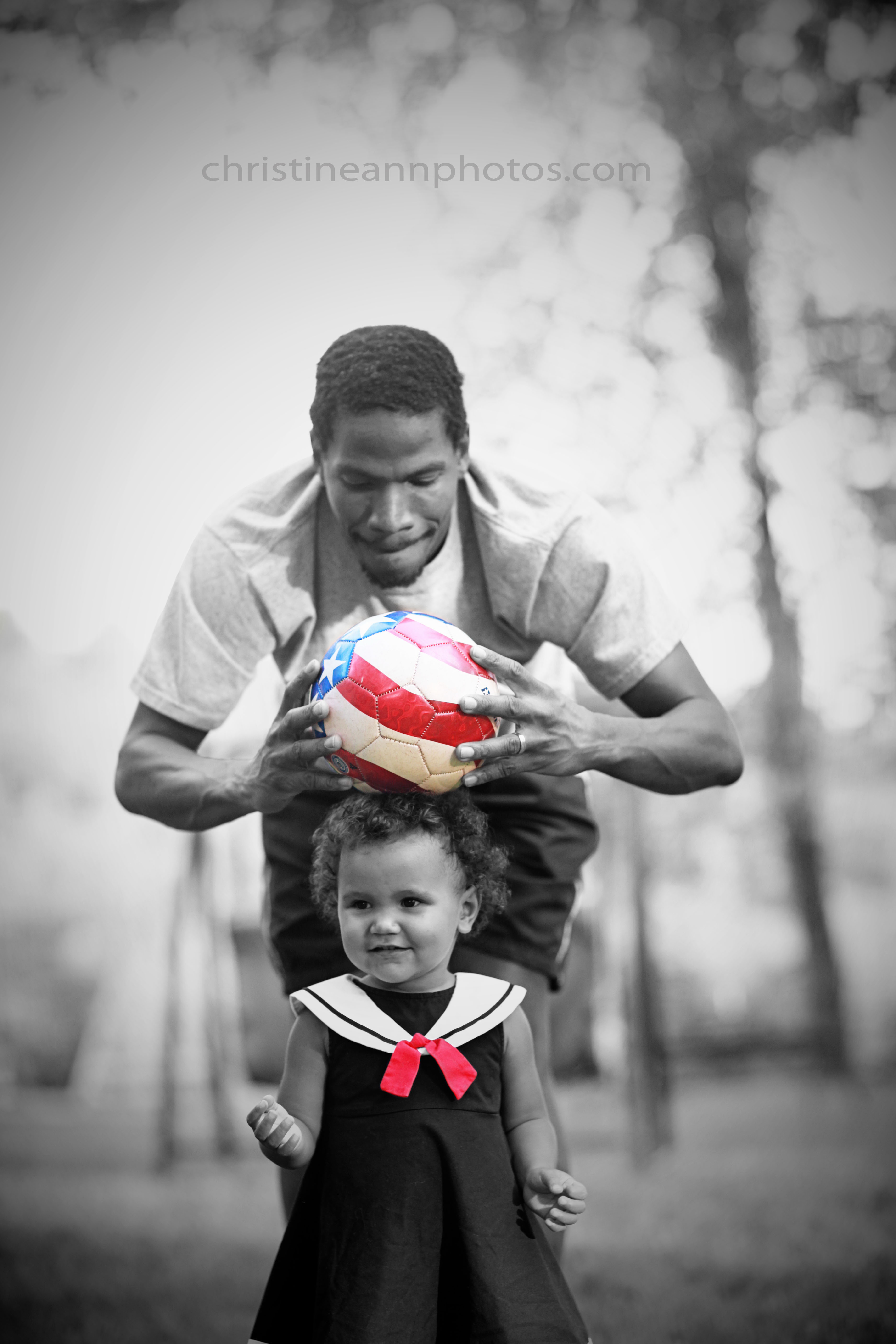
9. Went through all my photos – countless files! and built a folder filled with portfolio photos so that I had a way to show my work.
10. Decided a pricing structure. This was WAY WAY harder than I thought it would be! I tweaked it several times after creating it and am still working to find the “right” number!
11. Built my web site and linked it with my custom domain.
12. Started multiple business accounts: a new email address for business, a flickr account, a facebook account. linkd in, tumblr, google account, paypal, a blog (the one on my site plus this one).
13. Started a mailing list. Read a lot of advice to do this from the start 🙂 to retain people interested in your business and keep them interested.
14. Got a google voice number to link with my business so I can keep business separate from personal.
15. Ordered business cards.
16. Ordered test prints from multiple printing labs to find my favorite lab to do business with.
17. Started a banking account for my business.
18. Created a watermark and logo. (I’m currently redoing them with a graphic designer as I don’t feel like mine are all that grand but they did the job for starting out!). Remember with photography you have to build a brand. Part of your “brand” is your watermark/logo.
19. Get forms that your client will sign to give permission to use their images for marketing and relieve you of responsibility from the session if they get injured or whatever. Also will need property release forms if you shoot on private property, and print release forms if you plan to give them permission to print your images (do not confuse this for copyright release!).
20. Began marketing. (Also much harder than I anticipated). You are a business now, yay! But now you have to figure out how to get people to know about you! I have read it takes on average, about 2 years – and even as much as 5 years – to gain a clientele.. so be creative and patient.
I would also add to the list find a lawyer to consult with and an accountant/bookkeeper to help with taxes and numbers. I have family that is helping out with each of these jobs for me :).
I do have more social media accounts to create – quite a few more – but this got everything in motion. Honestly there are endlessly more things you could do and things I have done since starting up but this is just what got me started :).
Now I just have to keep up with filing taxes multiple times a year and keeping everything updated with the government!
Starting a business has been way – way – more work than I anticipated but it feels really good to be doing something that I love to do and once you get started you just figure it out as you go and it gets figured out!
-Christine Ann
Duluth Photographer
www.facebook.com/christineannphotos