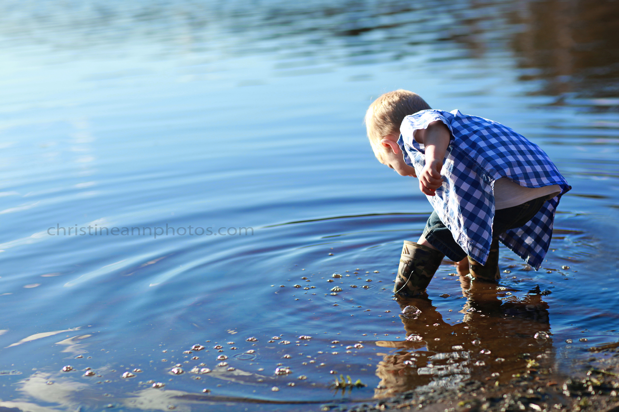
One long time mystery amongst people who take photos is “why are my photos blurry?”. The answer is much more simple than you probably realize but will take a moment to explain.

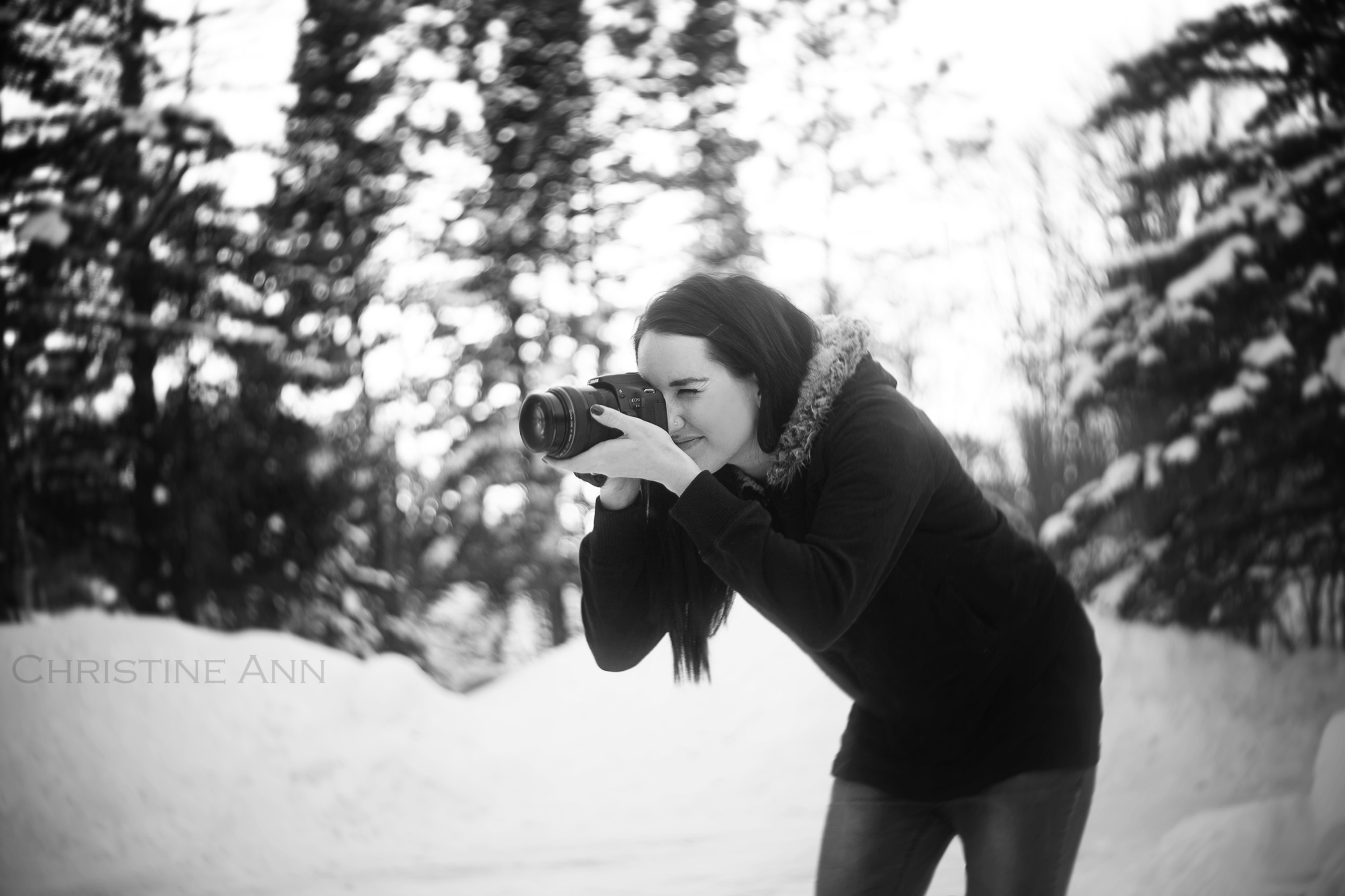
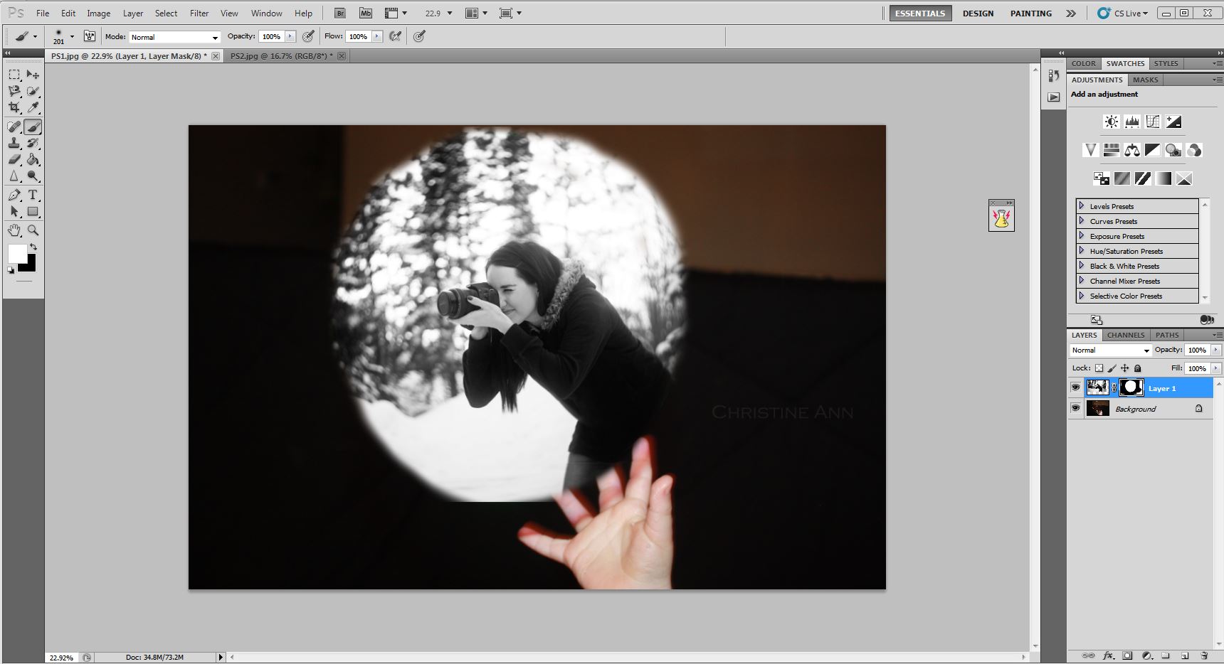
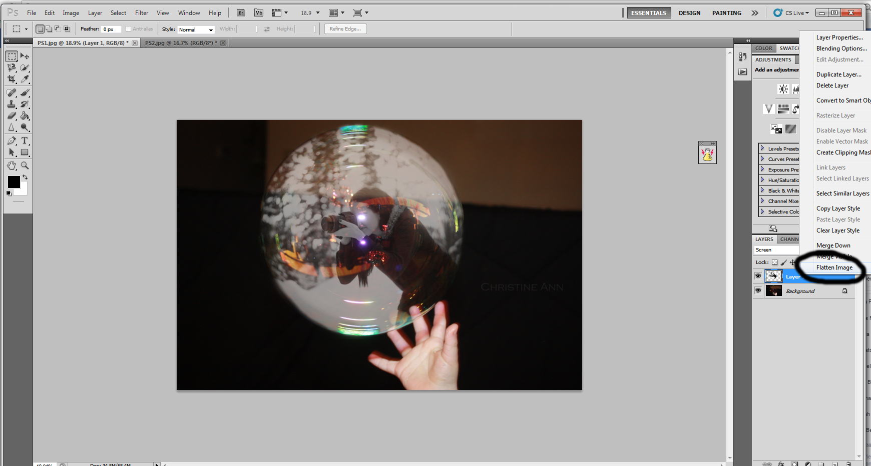
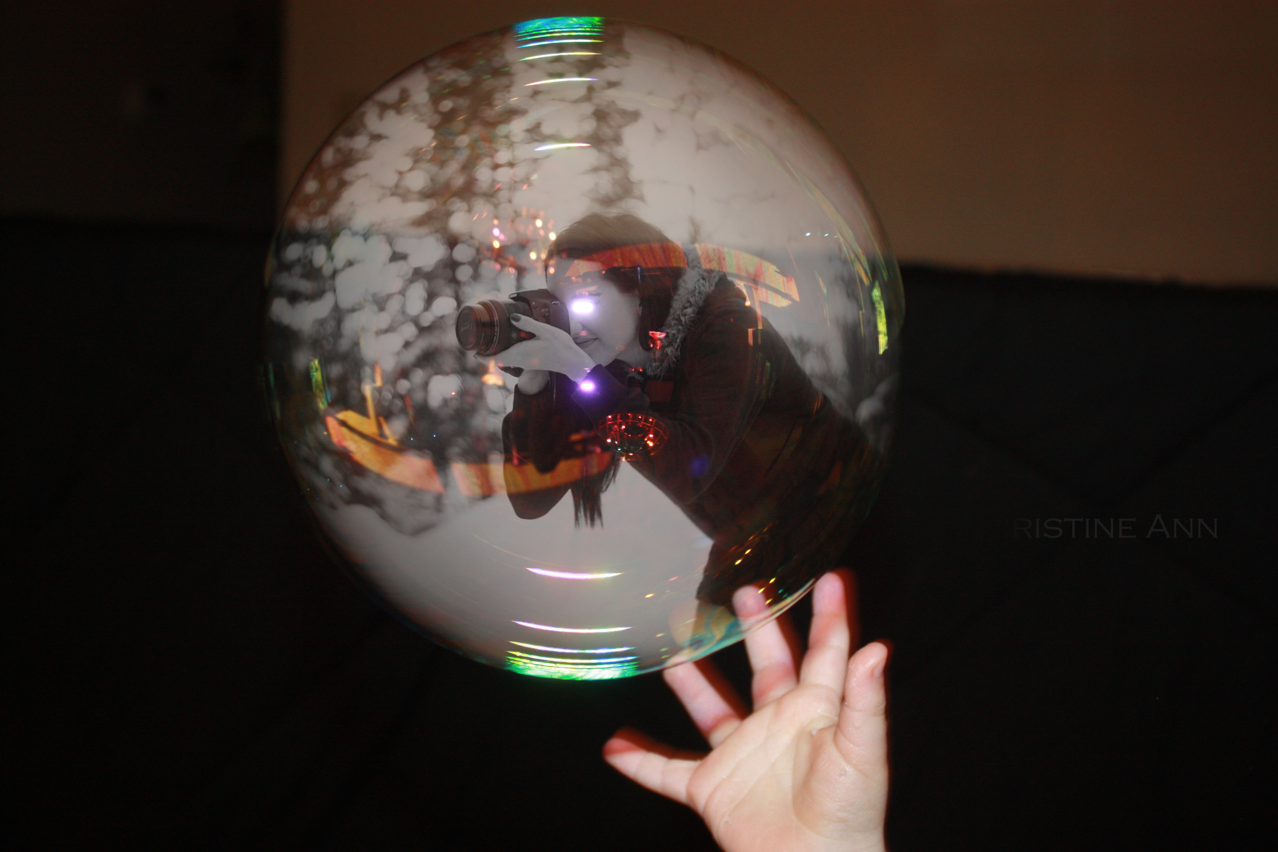
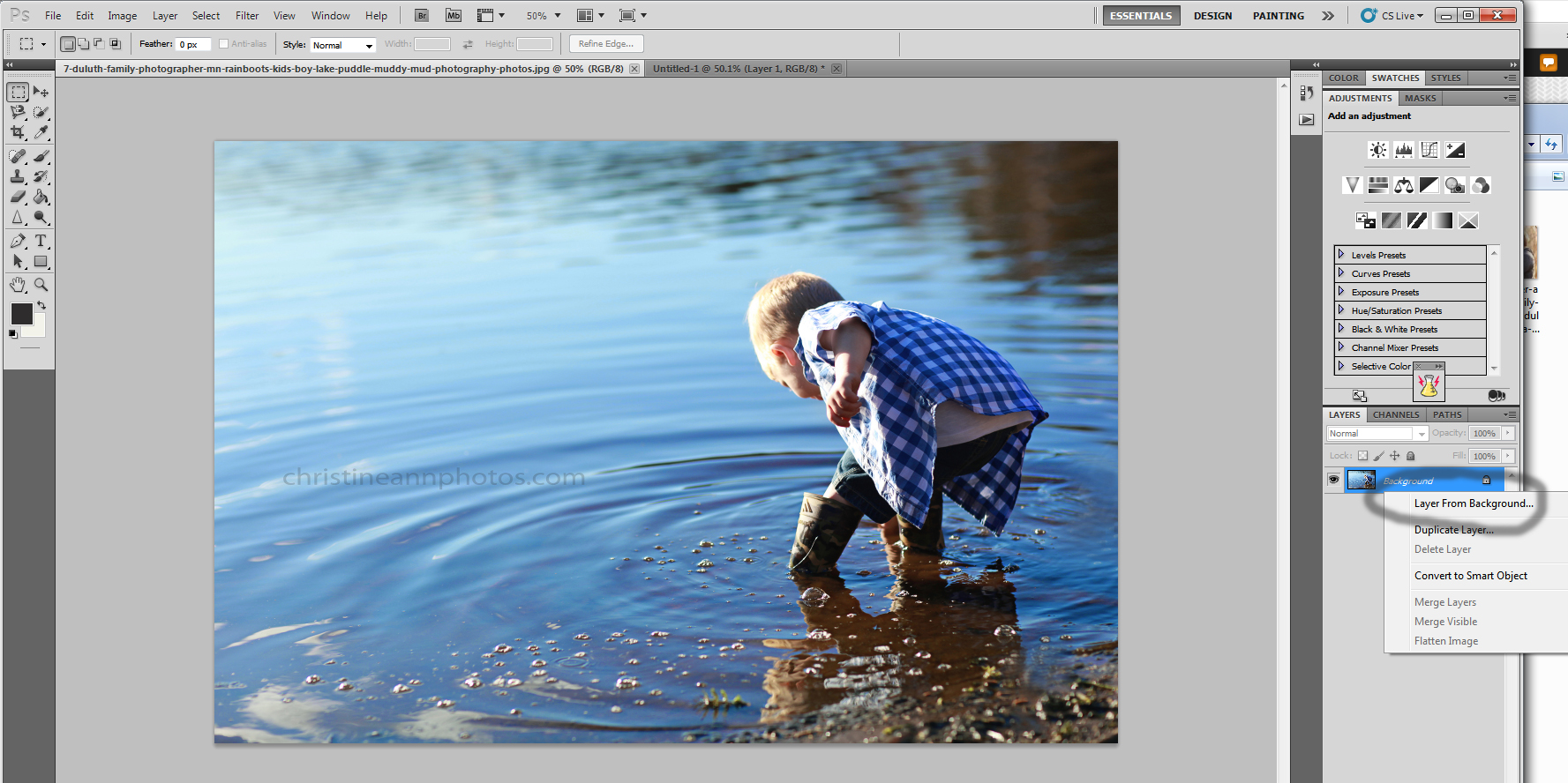
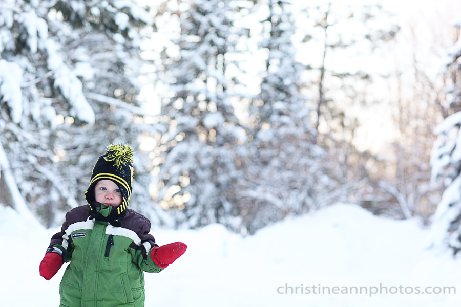
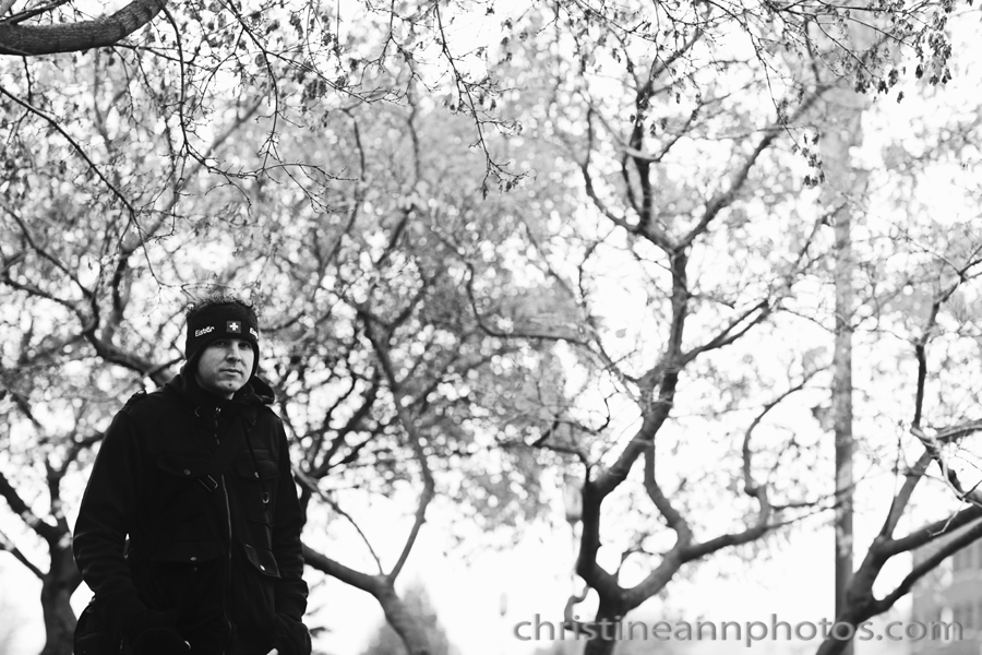
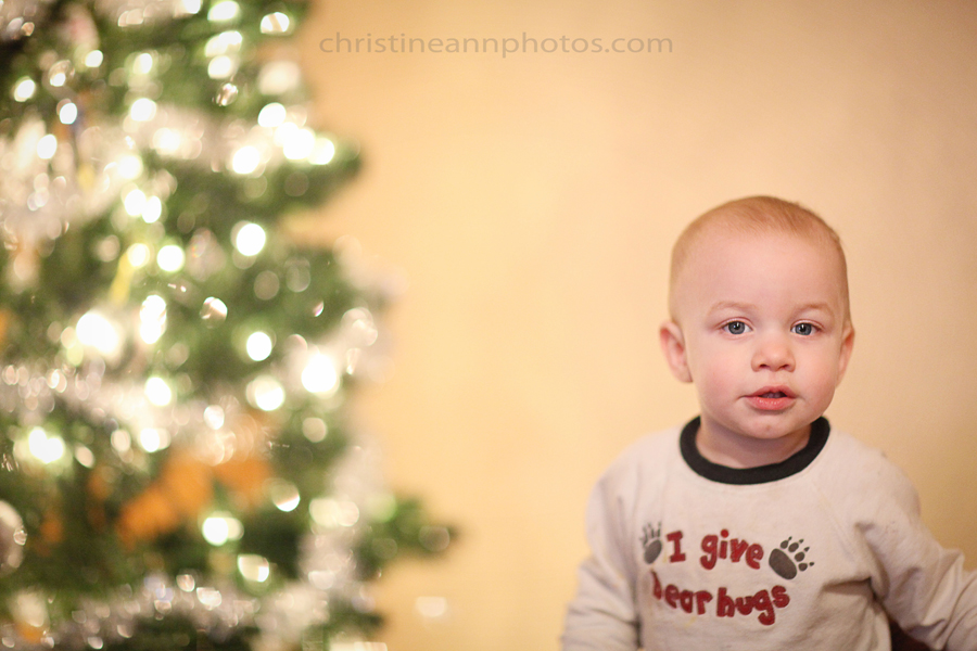
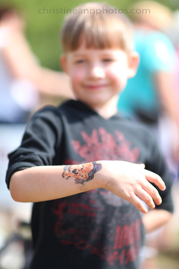
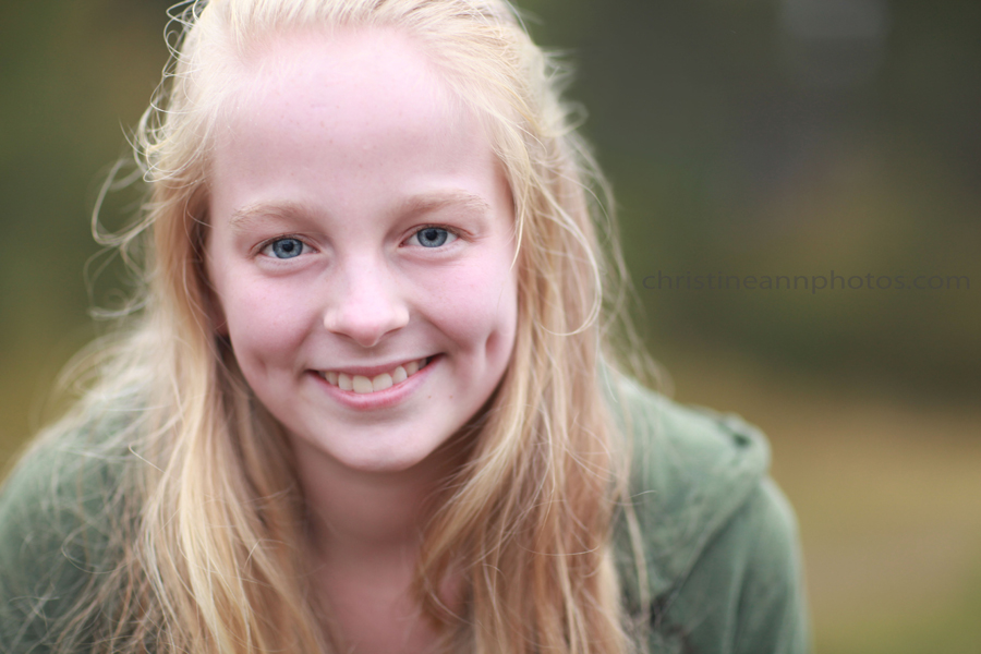
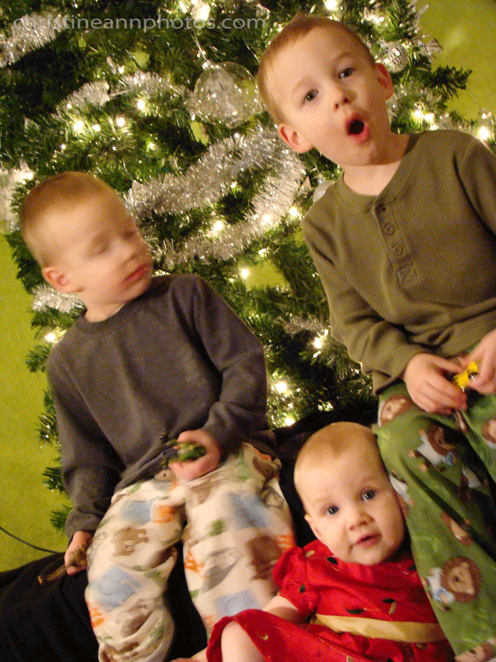
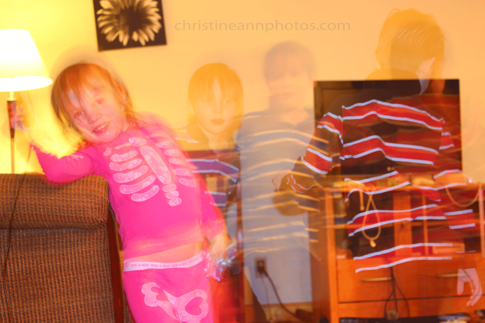
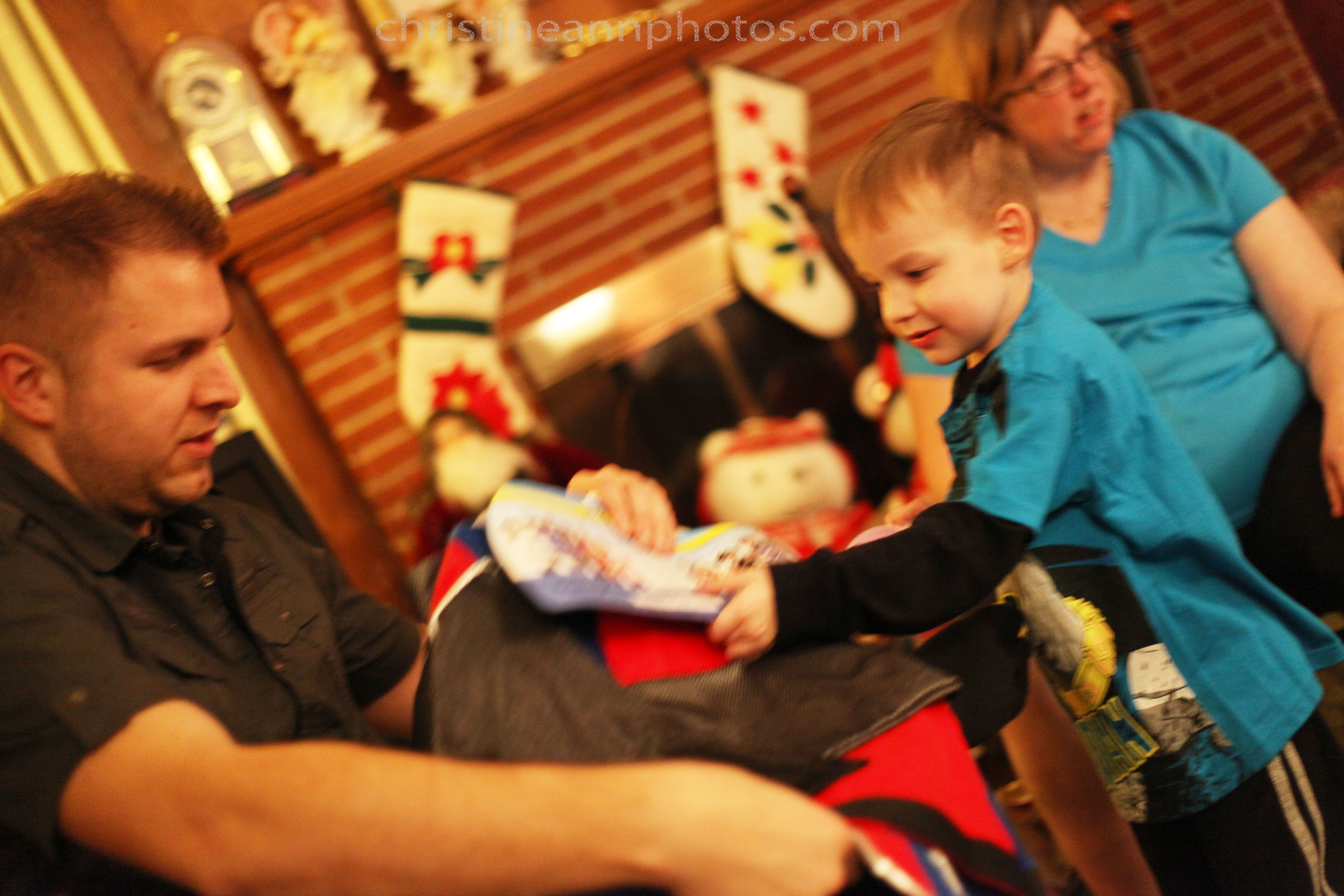
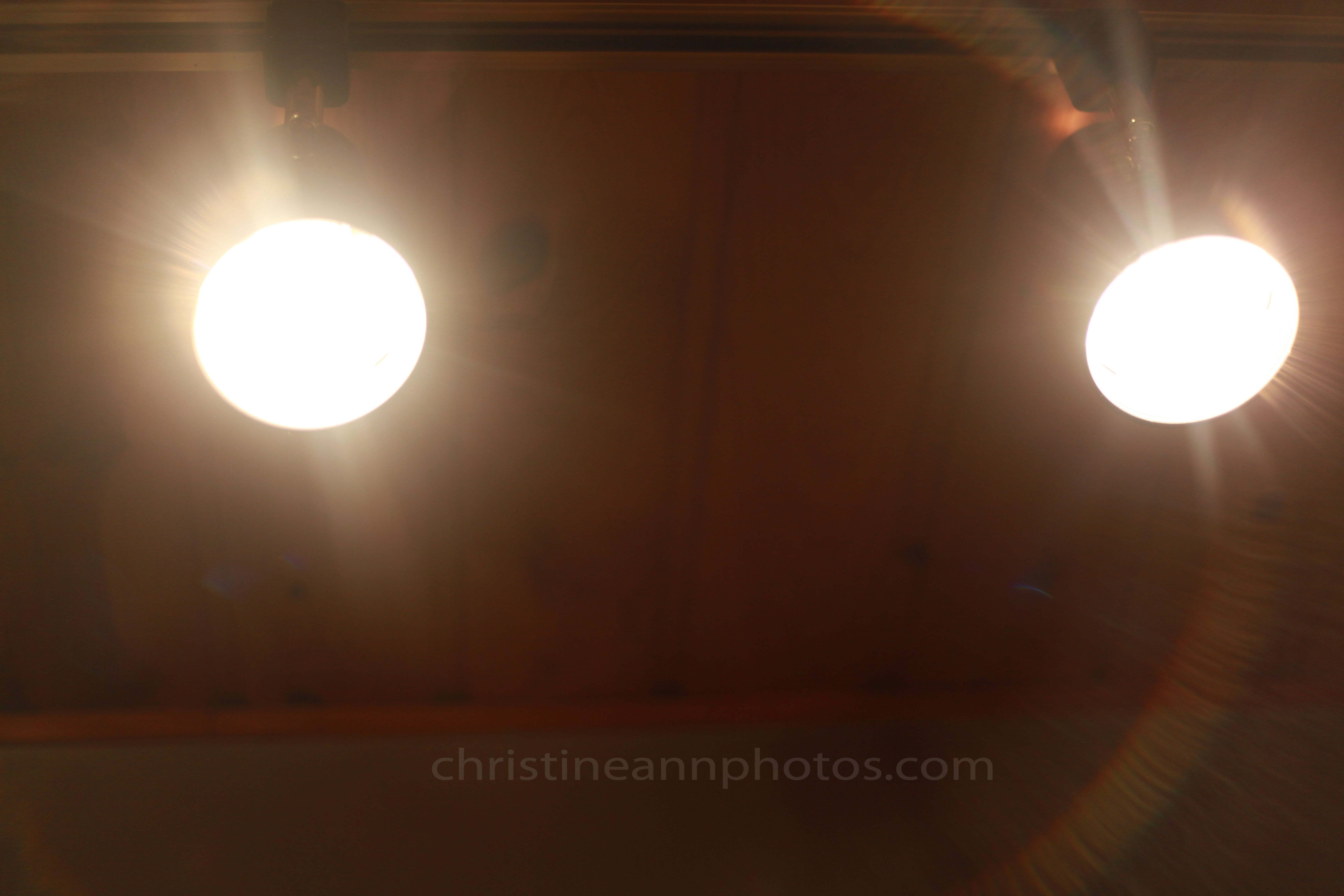
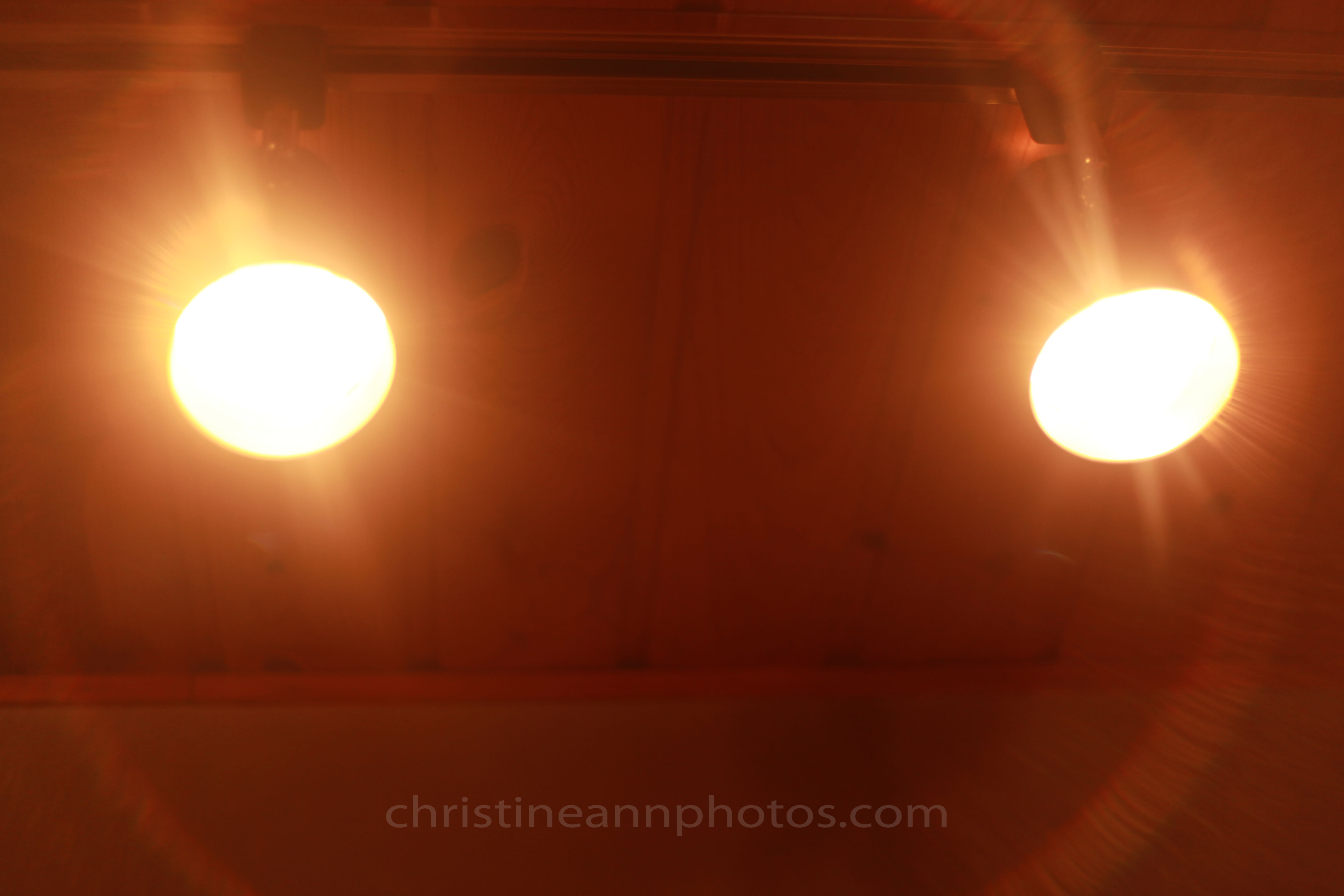
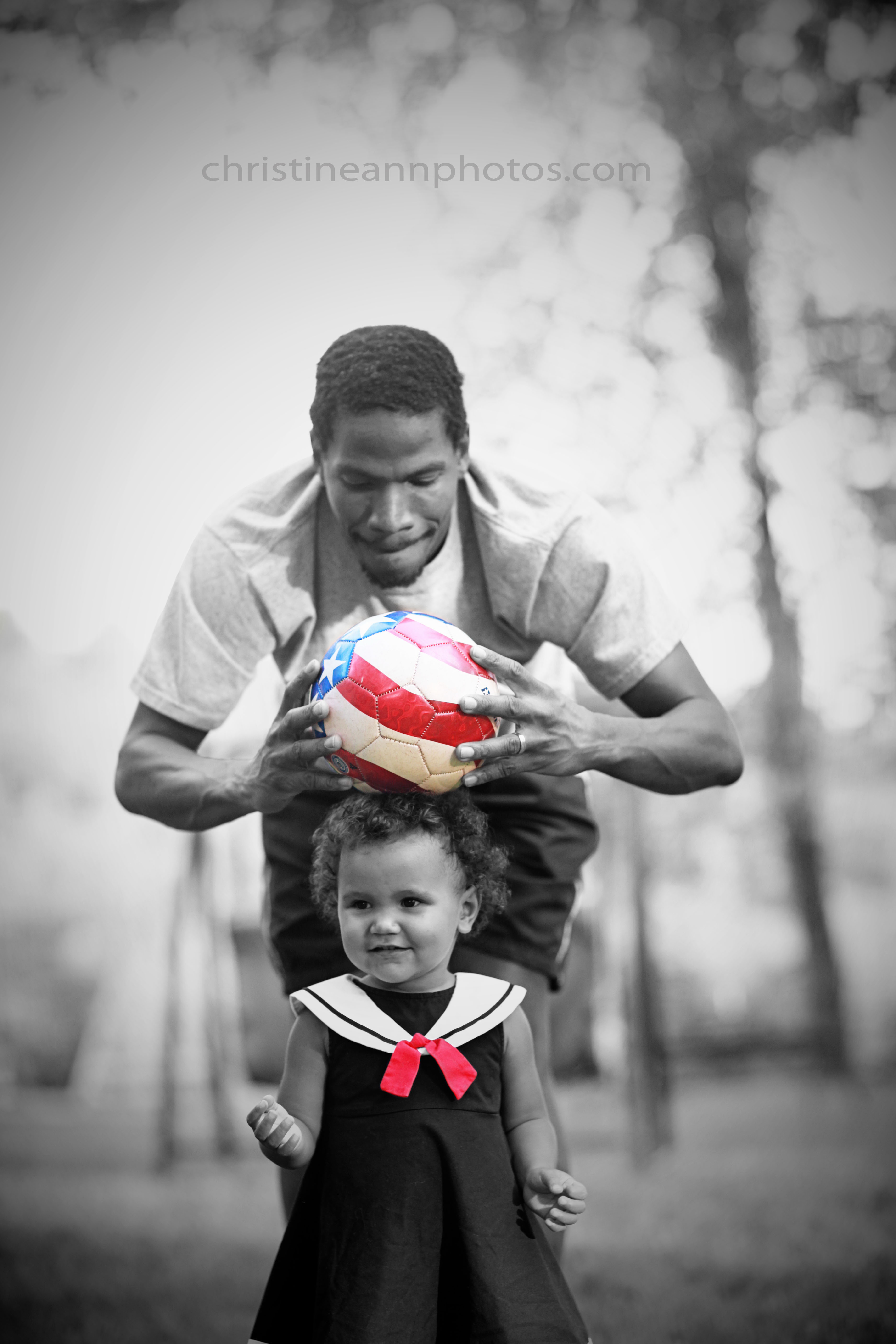
Photo from December 2010 😉 – camera settings this photo was taken at are listed later in this article.
There are 3 major components which determine how your photographs turn out.. one of those components is what your shutter speed is.
What is a shutter?
Picture a stage with curtains that open and close. This is, essentially, what a shutter is. It opens and closes (this is a video of a shutter opening and closing). The shutter is the sound you hear when you take photos – you can hear it open and close. Sometimes it opens and closes very fast and sometimes it opens and closes very slowly. When the “curtain” (shutter) is open, it captures ALL movement in the photo up until it closes. Hence, when it opens and closes fast it “freezes” the moment and does not capture any blur; when it opens and closes slowly, it captures a lot of movement.
The shutter is responsible for 2 things:
1. It contributes to how light or dark the photo is
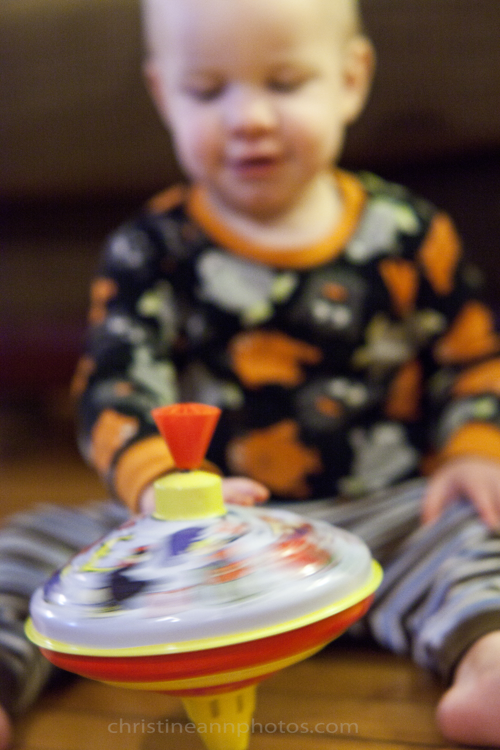
2. It is the reason your photos turn out blurry or not blurry (*from motion blur – Photos being out of focus can make them blurry in an “out of focus” way which is not due to the shutter).
If you are getting motion blur in your photos there is one simple answer for it: Your shutter is staying open too long.
So, what causes the shutter to stay open for too long?
Low lighting.
Now that I’ve said that you’ve probably realized that most of your blurred photos were taken indoors or at night.
Why does it stay open long in low lighting? Because the longer the shutter is open, the more light it lets in. Photos NEED light. If there isn’t much light, your camera needs to do things to make sure it gets enough light, otherwise you will be left with a black photo.
The photo at the top of the page was taken at the following settings: f/3.2 ISO 640 Shutter speed 1/8 (aka too slow!!!!).. that means it was open for 1/8th of a second which sounds fast but it isn’t fast enough for kids who move around. I usually try to stay around at least 1/100, and ideally a little higher, when photographing kids (what speed you set changes based on your lens and what you are photographing; things that are sitting still can be photographed at a lower shutter speed but you still have to shoot fast enough to avoid camera shake from your hands unless you are using a tripod).
How to Avoid Motion Blur in Your Photography
The easiest and most simple way to avoid motion blur in your photos is to get more light! Take your photos outside or closer to a window. You can also just turn more lights on inside but then you might want to be aware of your white balance because a lot of photos taken indoors will have an orange/red tint due to incorrect white balance (<– article about that tint and how to avoid it).
The last option is to use your flash. Most professional photographers will agree that the flash built into your camera is not good and actually hurts your photos. My rule for using in-camera flash is only use it if the alternative is a super blurry or black photo. A photo with flash is better than a blurry or dark photo. The other option for flash is to buy an external flash – one you can take off the camera and diffuse it. This is the ideal option if you need to use flash (I will write more on this later!). I try to shoot outdoors as much as possible :).
If you own a DSLR there is another option for eliminating motion blur: Set your own settings and tell the shutter what its speed needs to be.
There are two modes in which you can do this:

TV Mode. TV mode is found on your dial and it is “shutter priority mode”. Shutter priority means that all other settings are formed around your shutter speed.. so you tell your camera what your shutter speed needs to be, and it figures everything else out for you. It is a good setting for people starting out with their DSLRs – however there can be consequences to this such as your camera may bump up your ISO, causing your photos to be grainy, or shoot at too high or low of an aperture, losing the “blur” effect or giving you too much of a blur effect.. however you can guarantee they won’t have motion blur 🙂 and sometimes you have to made decisions like that (ie I’ll have a grainy photo instead of a blurred photo) because when there’s not enough light, something’s gotta give.

M Mode (Manual Mode). This is ideal. This is the mode most professional photographers shoot in. You tell your camera exactly what the settings need to be and it shoots at that regardless of what it would want to do in auto mode. You set the shutter speed (if you’re getting motion blur you increase the shutter speed), you set the aperture, you set the ISO.. you can understand what is happening in the photo and what the outcome of the photo will be based on your settings, however it requires more knowledge than TV mode so it’s perfectly fine to start with TV mode and keep working towards M mode.
The fun part of understanding how the shutter affects your photos is that you can use it to intentionally capture motion blur and make some interesting photos! Leaving the shutter open on purpose is called Bulb Photography.
To do bulb photography you must put your camera on a tripod so it stays perfectly still (otherwise there will be camera shake which will hurt the photo) and then have the subject move around while you leave the shutter open and capture all the movement.
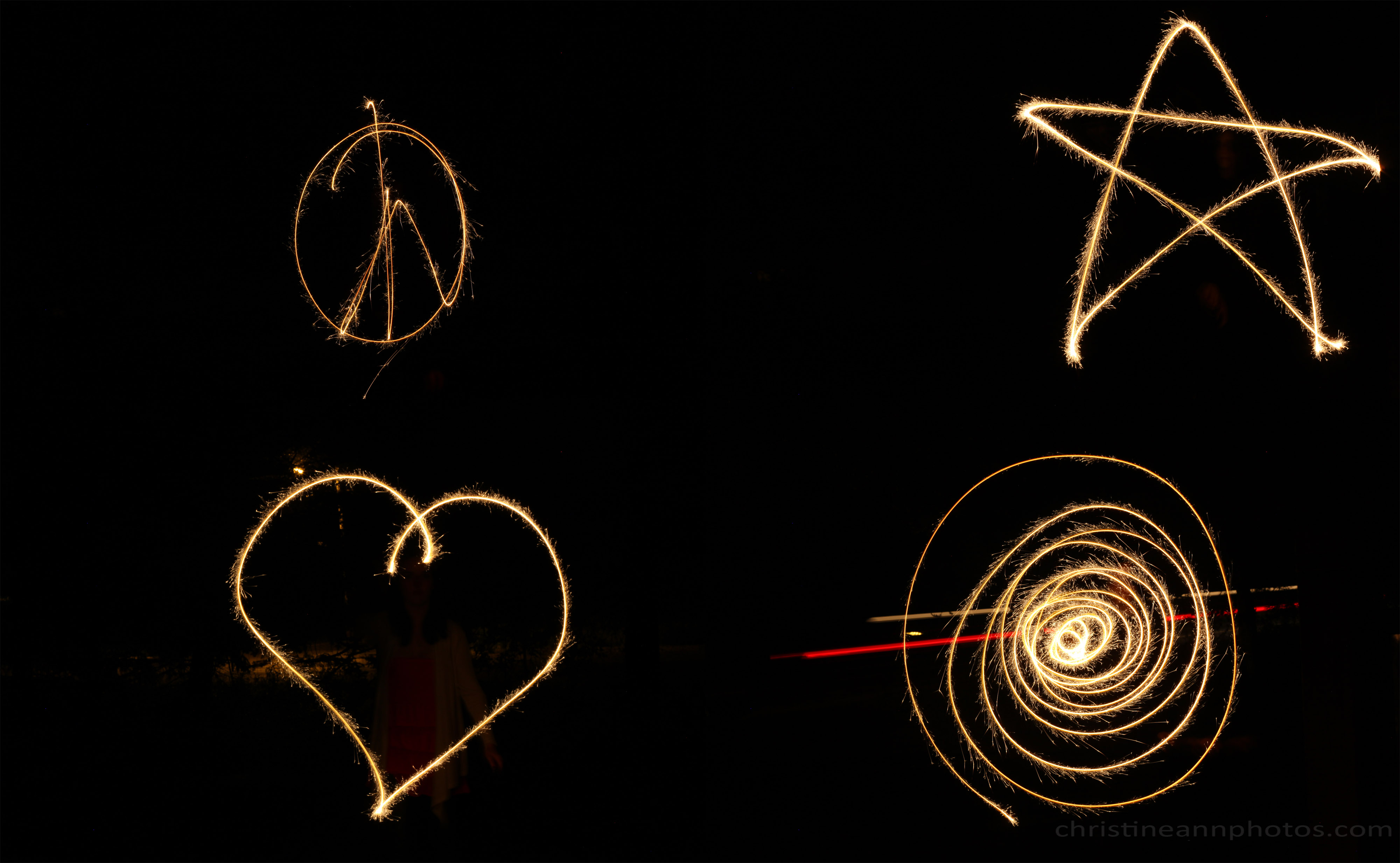
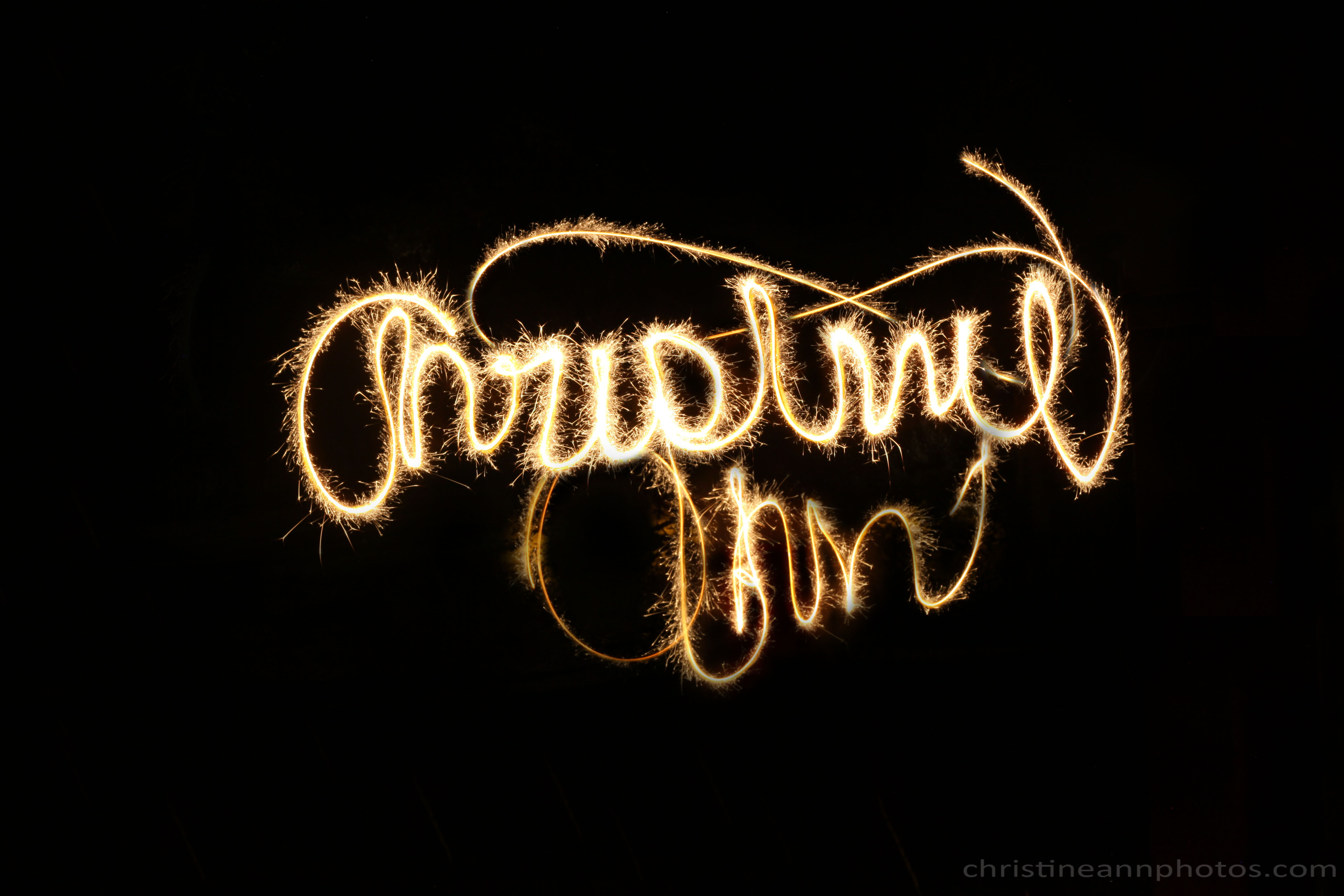
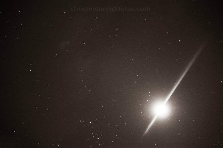
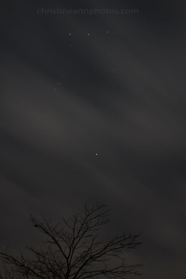
Here are some examples of the camera being on a tripod with the shutter left open:

f/3.2 ISO 6400, shutter: 1/25.

Notice in the bottom right photo you can see 2 red streaks in the background – those are the taillights of a car :).
Settings: f/11 ISO 500, shutter speed 4 seconds (shutter was open for 4 seconds).

Settings: f/11 ISO 500, shutter speed 7 seconds (shutter was open for 7 seconds). I was wearing all black to minimize being seen and did additional editing to completely “disappear” from behind the sparkler otherwise you would see me as motion blur in the background :).

(My white balance is off in this photo which is why it has a red/orange tint).

Most photos of the sky at night are done on a tripod with the shutter left open.. it allows the camera to pick up many stars. When I do exposures like this, the camera “sees” many more stars than I can.

—–
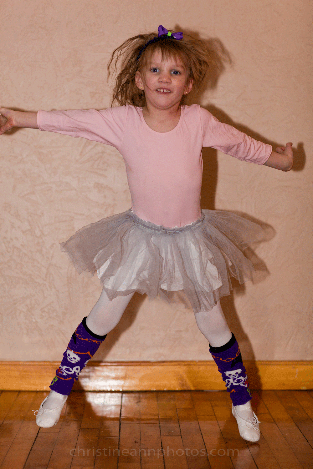
Fast shutter speed:

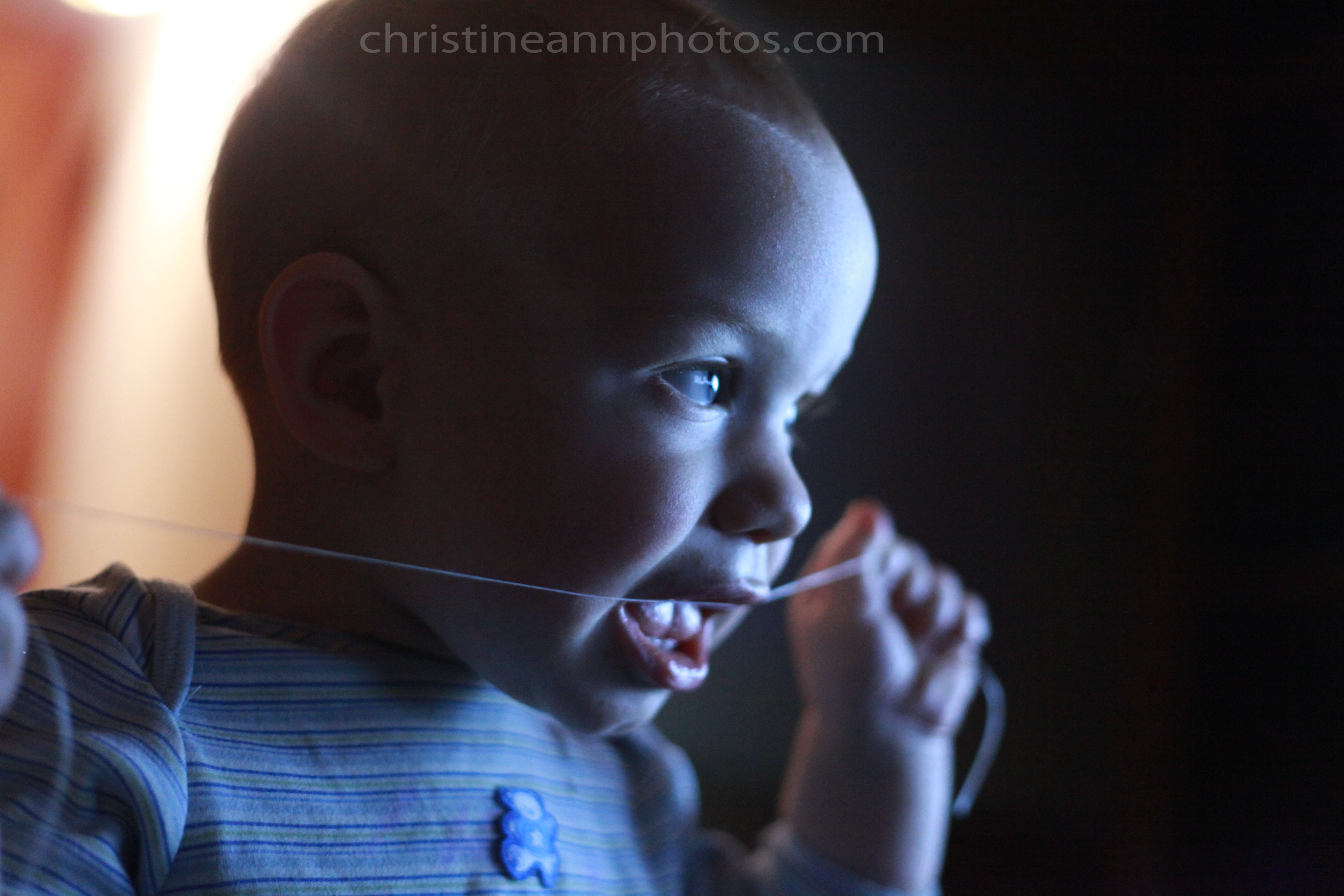
Just to contrast these photos with slow shutter speeds, here is an “action shot” frozen because of the fast shutter speed
ISO 100, f/9.0, shutter speed: 1/320 Please ignore the harsh lighting :p I only posted to show a photo taken with a fast shutter speed 🙂 she is mid-jump and there is no motion blur! At a low shutter speed there would be a ton of motion blur.
-Christine Ann
Duluth MN Senior Photographer Website
Facebook


