Digital Backdrops

What is one great way to ruin a photo?  A wrinkled backdrop!  I recently did a session.. I had planned to use a non-wrinkled white backdrop but had to swap at the last minute.. it looked okay at a glance but when I pulled up my photos I quickly realized how wrinkled it really was.
When you have a wrinkled backdrop there are only a few things you can do: You can keep it wrinkled You can edit the wrinkles out (what most people do) You can use a digital backdrop I haven’t had much luck with digital backdrops in the past.  I feel they often times look very fake and cheesy.  However if you search long enough you can find ones that look more natural.  So much faster than editing the wrinkles out!  I will post a sample of my before and after photo using the straight out of camera image (I did edit a flyaway hair but everything else is unedited) and then the edited version with a digital backdrop, starting with the unedited.

IMG_5994zz
^
This is the original, unedited version.. notice the no good, wrinkley backdrop and how distracting it is. Nichollsbw (33)zstamp
^This is the edited version, used with a digital backdrop.  I could edit wrinkles out by hand but this method saved me a lot of time! If you would like to use a different, digital backdrop but don’t know how to do it I have a tutorial for changing backgrounds/doing face swaps here.

-Christine Ann Duluth Photographer {Website} {Facebook}

Instantly Improve Your Editing With Layer Masks

There are about 5 million different things you can do to edit a photo in Photoshop.  Some of the things you learn will be totally pointless and some will be invaluable.  I am going to brush up on one of the most valuable editing techniques (in my opinion):  how to add a layer mask to your layers and why they are important.  This will benefit you in so many ways!  And it is SO EASY! Learning new things in Photoshop is always intimidating but this is literally something you can do in a couple clicks.  (To summarize:  you layer 2 photos on top of each other, click the layer mask button, select a black or white paintbrush to hide/reveal the bottom image and that’s it!). Directions for adding a layer mask: Open up a photo in Photoshop.  Pick another photo to layer on top of it (you can just copy and paste it on top).  Click on the top layer so it is highlighted and then click the square with a circle inside it at the bottom of the layer palette (The layer palette is where you see all your layers towards the right side of Photoshop).  The icon I am referencing, if you hover your mouse over the top of it it will say “add layer mask”.  It looks like this: Image Click on the white box that appears next to your top layer. Image That’s it! You are done, you’ve applied a layer mask! Now how do you use it?  Also very easy.  Select the paintbrush icon and make the color that it paints white.  (Image below shows where to select the paintbrush and where to change the color of it at). WhitePaintBrushStamp Paint wherever you’d like to reveal the image below and you will reveal the image beneath it!  If you make a mistake simply change the “white” color of the brush to black and it brings back the original image. layermaskblackbrush layermaskwhitebrush ^ Example Photos: Color photo on bottom, black and white photo on top, layer mask selected (you select it by just clicking on it), select the paintbrush and make it black and just start painting.. it will reveal the photo beneath it.  If you make a mistake and want to bring the black and white image back, simply turn it white, like in the second photo.  :). Boom.  Done :). This method is perfect for head swaps (place the new face underneath the one you want to change and reveal the photo below it).  It is also perfect for doing selective coloring (adding color to black and white images).  You can change the background of your photo by adding a nice background behind the image and masking the original background off.  You can edit things out like power lines by moving the bottom image a few centimeters to the right and masking  them out.  There are so many possibilities! TIPS: 1.  You can change the opacity of your brush.. so if you only want to kind of reveal the background but not entirely, just set the opacity of your brush 50% (vs 100% and it will only bring 50% of the background in and leave 50% of the original intact.  You can also build on it by changing it to 10% and doing another round, bringing it to 60% revealed).  It looks much  more natural if you build up in that way vs just doing it at 100%! 2.  If you right click on the “background” (the bottom) layer and select “layer from background” you “unlock” the layer and can now move it around.  You need to be sure to highlight (click on) this layer when you want to apply changes to it (such as moving it.  You can move it using the move tool).. and then when you want to apply the layer mask with the white and black brush, be sure to click the white box next to the top photo :).  Any changes you make will occur on whatever is highlighted in the layer’s palette. 3.  There is a learning curve to using layer masks in a realistic way.. such as when you get to the edges you need to make the brush smaller and that it really  helps to lower the opacity of the brush to blend it better.  But after a few rounds of practicing you’ll start learning how to do it better and better. If you have any questions, please feel free to ask! -Christine Ann [website] Duluth Photographer Christine Ann Photography Facebook Maternity, newborn, senior, wedding, family, children, portrait photography.

1 Tip Which Will Improve Your Color Pop/Selective Color Images

I frequent many photography forums and one topic that comes up often is “color selection” or “color pop” edits.  This is when you have a black and white images and you bring back color on just a couple select spots.  These images are not often well received by lot of pros.  I am amongst this group 🙂 but they do have their place :).
I think the worst part about color selection is just how harsh the color is in the image.  It doesn’t flow well.  This is when I created my own way of doing color selection photos, where you just bring back about half of the color instead of all the color.  It makes a huge difference!  And I definitely much prefer the subtle color to the sharp, vivid color.

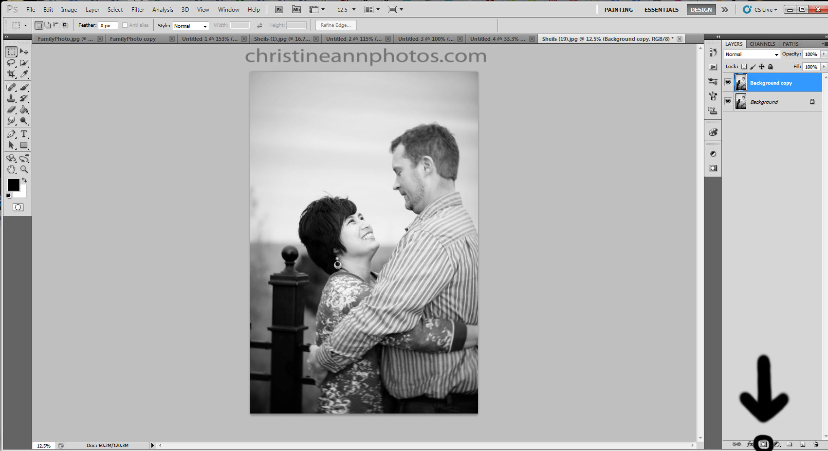
How do you accomplish this?  If you are layering a color image over a black and white image and erasing, then erase away at around 30-40% opacity.
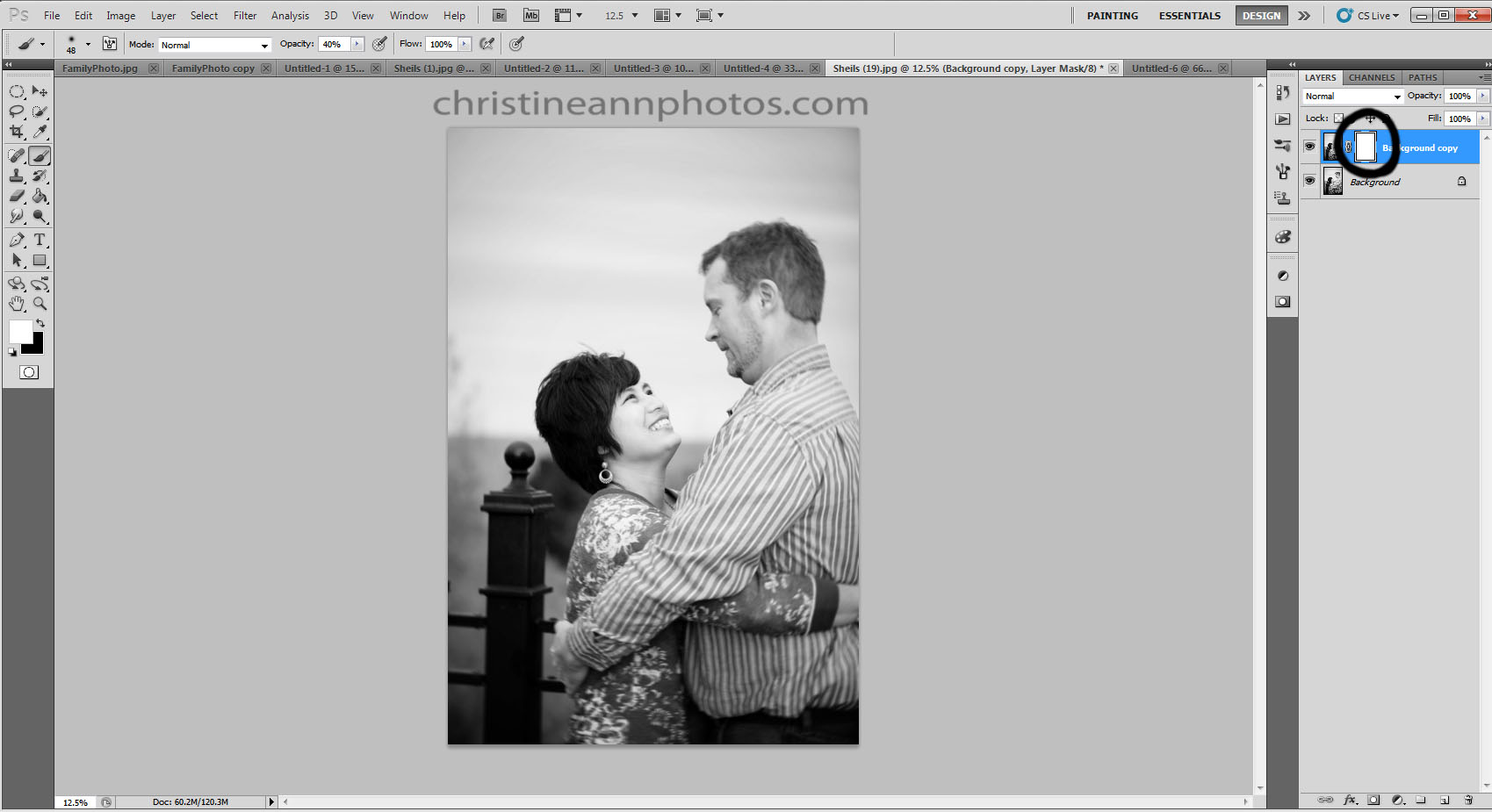
If you are using a layer mask, set your paintbrush to around 30-40% opacity.  tada!  Very simple indeed.  This will make a huge difference in how the photo looks after you edit it.

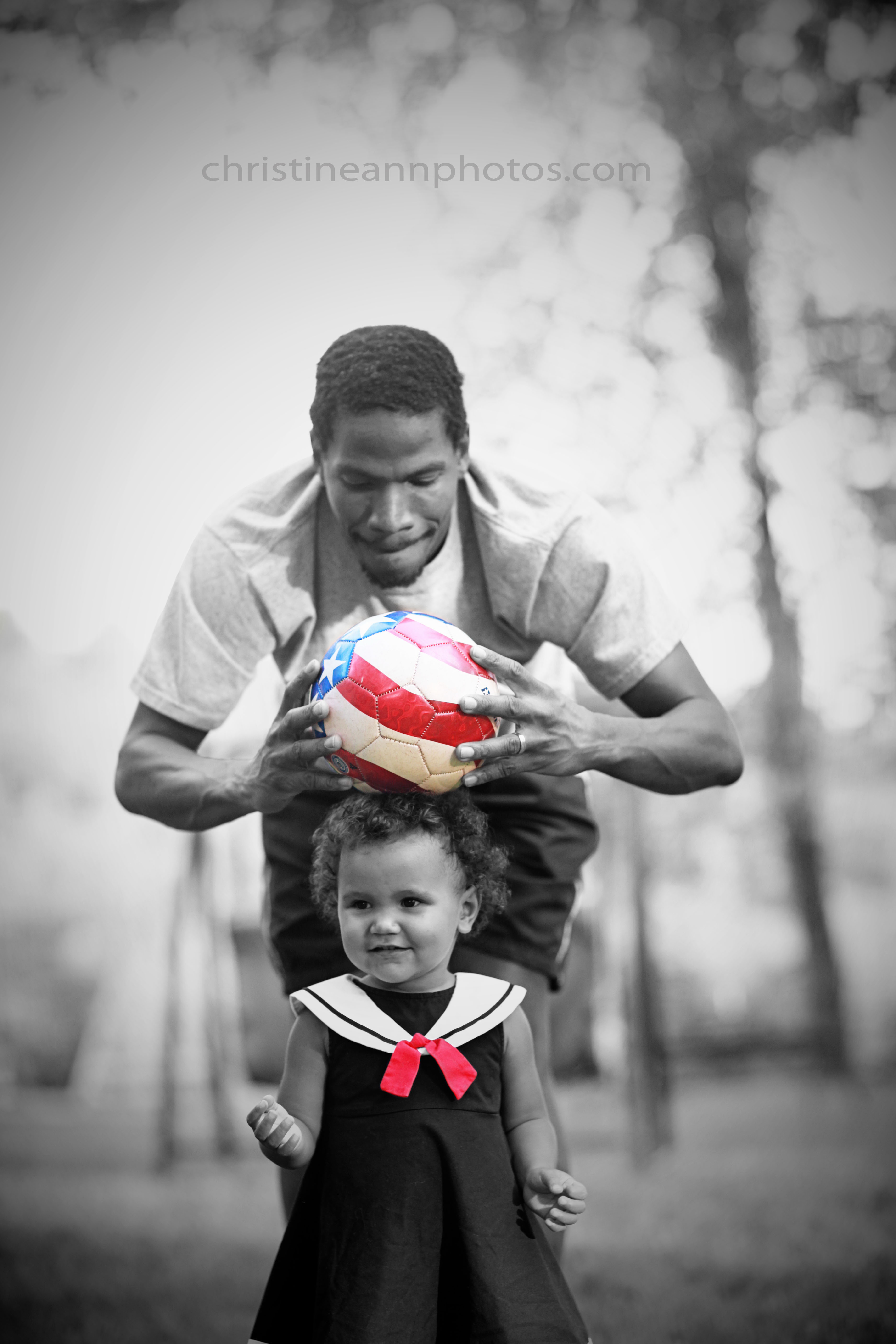
One other tip I have is to pick just one focal point to selective color..a lot of people go a little crazy with their brush and bring back half the image so it’s half color and half black and white.  This looks a bit odd and unnatural and also there is no real concept behind it.  Usually you want to color pop something with meaning or symbolism or a concept (not always but like usually just an item vs a shirt).  In the sample image I am posting here I decided to have 2 color pops so they would balance each other out more but notice the items I picked were small so it doesn’t overwhelm the photo.  I believe my opacity for this image was around 30%.. to do it again I  might bump it up a bit higher, but you get the idea.

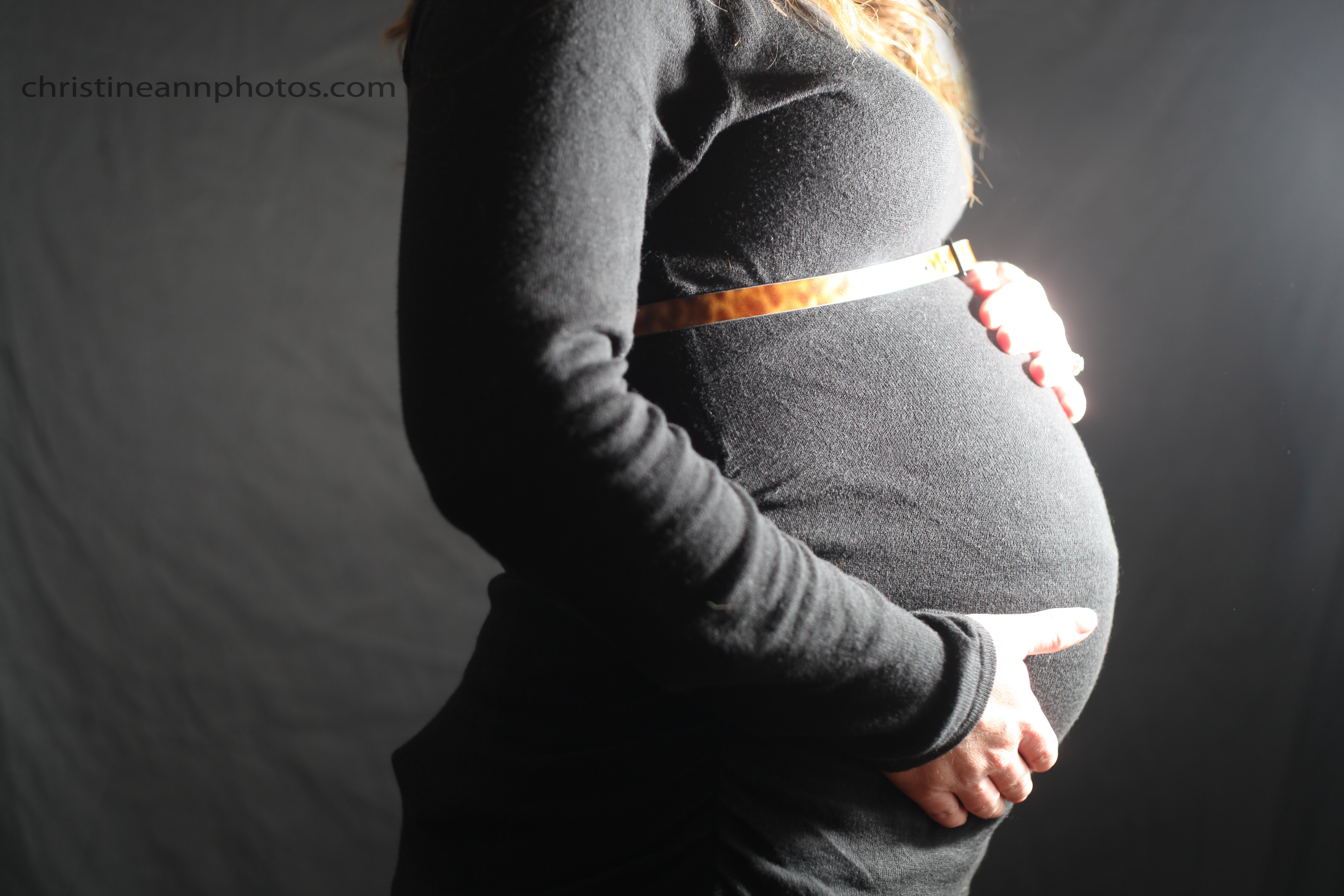
This is the image at 100% opacity.. this is the full color image brought back to the black and white image, and this is what most photographers who do color pop do:

IMG_3908zzzzstamped

^ Color brought back at full strength.

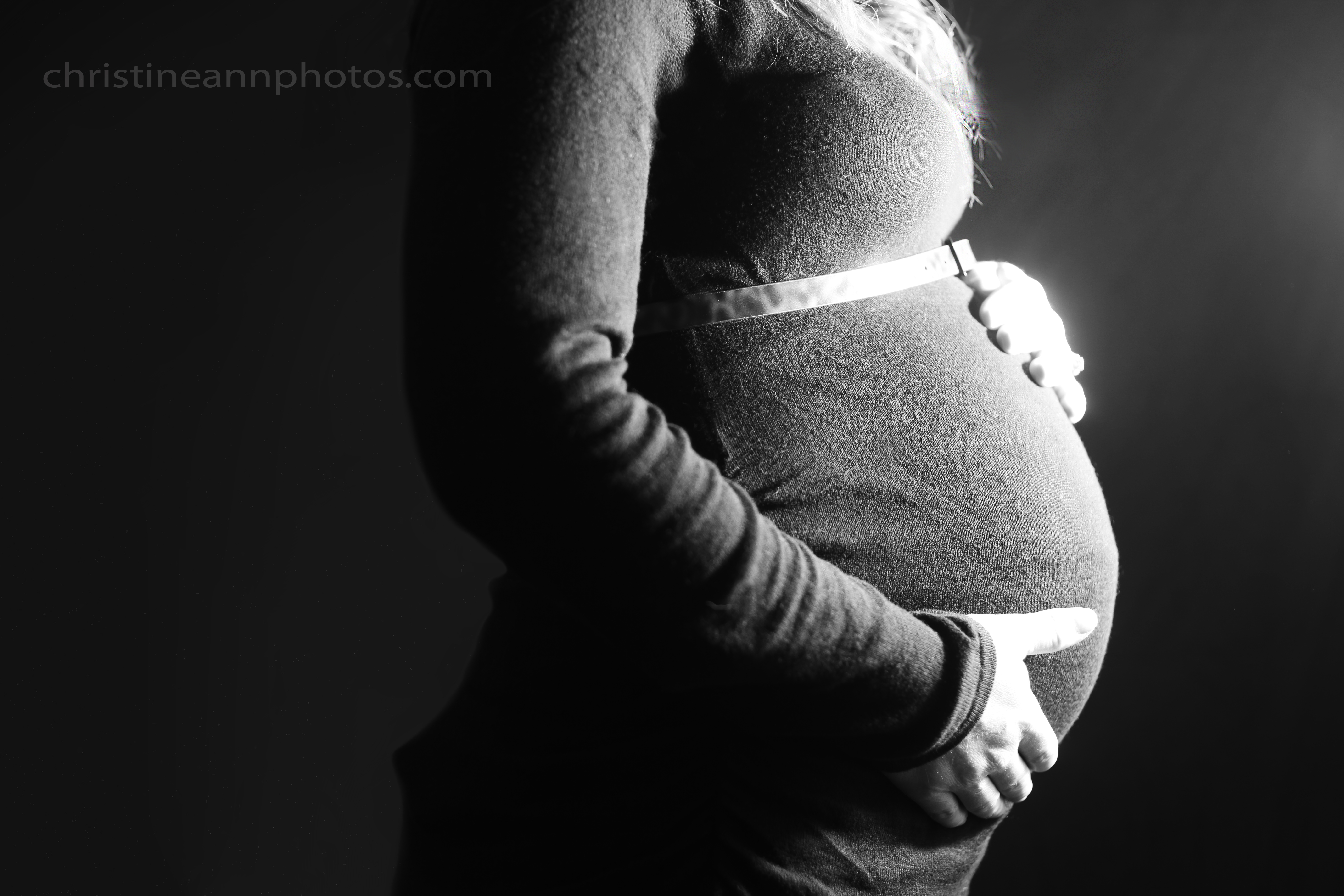
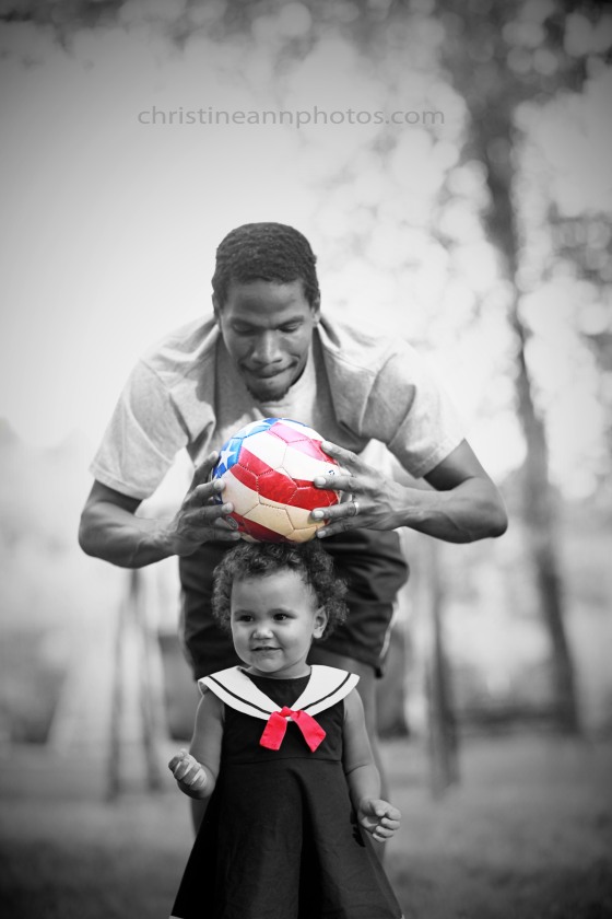
And the photo shown below is the same image with the color brought back around 30% opacity.  It might even be more like 20%. It is a little bit dull but it looks so much less distracting and more natural.. I much prefer it to the full color photo.

IMG_3908bwstamped
^Color brought back around 20-30% strength.

For one more example I’ll show one brought back around 50% opacity.
Selective coloring color pop how to improve technique with image example

^Color brought back around 50% strength. This is my favorite edit of the three (I might tone it down a notch but overall the color isn’t too overbearing and “sharp” and it blends much better than at full strength – in my opinion anyway!).

As with all things in photography, which is better is subjective.  Surely there are people who prefer the first to the second.  If you do like the first you could even play around with bringing back the color around 70%-80% so it’s just not so vivid and contrasting.  While I’m not a huge fan of color pop photos, I do find myself much more receptive to them when done in a more subtle manner, just thought/style I would share with everyone :).

-Christine Ann
Duluth Minnesota Photographer
Website
Facebook