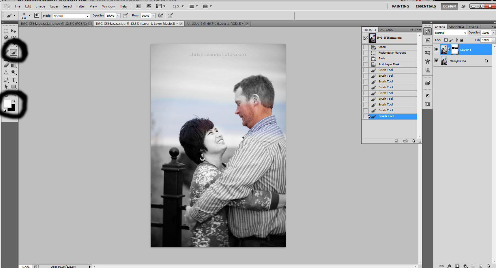
It was 2 AM and my frustration levels were high. I had created many different watermarks/logos but none of them really fit me or cued that magical “hallelujah” music inside my mind.
I had an idea of what I wanted I just couldn’t find the right components to make it happen. Trying out so many different things got me thinking about how incredibly much a watermark affects how a viewer views your photos.
If you slapped a generic watermark together and called it a day, it might be time to step back and reconsider.
A watermark is a very simple concept.. it’s basically something you put on all your photographs to reduce photo theft and to let people know who took it, yet everything about your decisions in watermark reflect a style that becomes a part of your brand.
You may not realize it but every aspect of your watermark affects how a photograph is interpreted. Things to consider when creating your watermark stamp is:
Font, Opacity, Color, Size, Placement, Wording, Consistency
We’ll go through each of these in this post as well as compare the same photo with different watermarks so you can see how the watermark affects how the photo and your brand/style comes across.
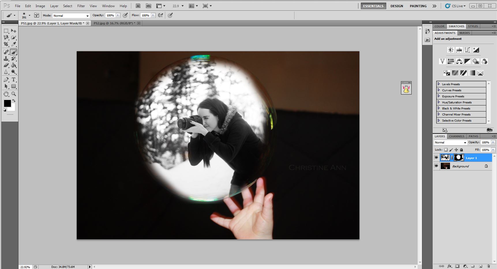
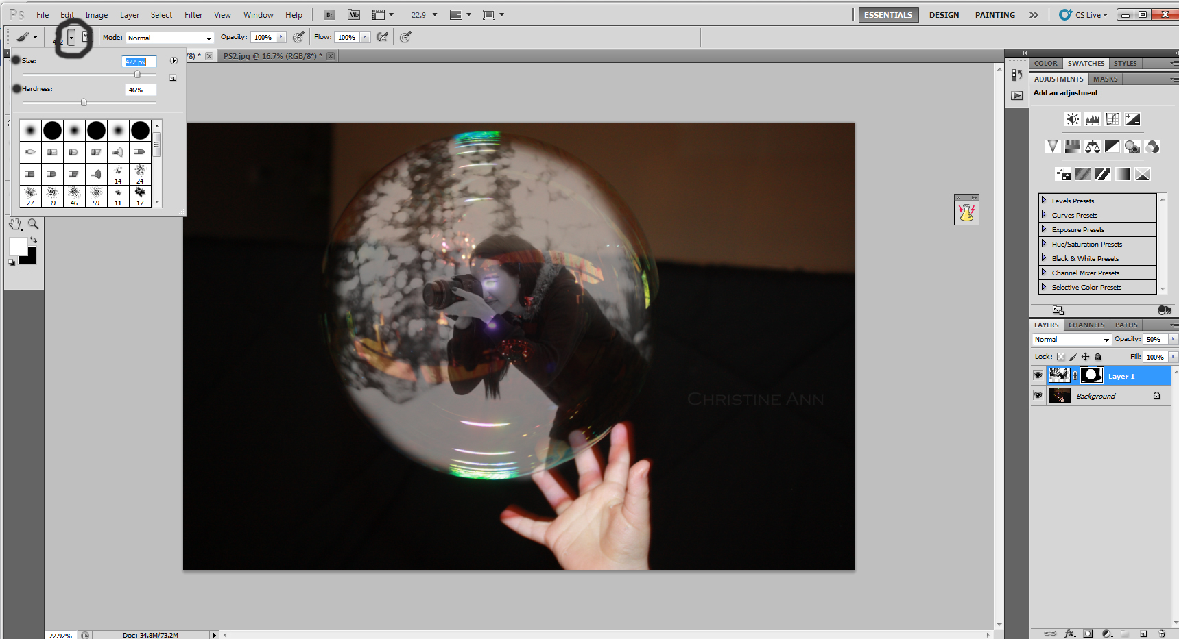
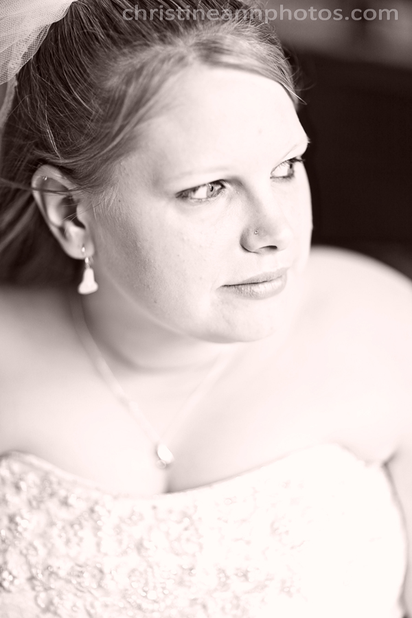
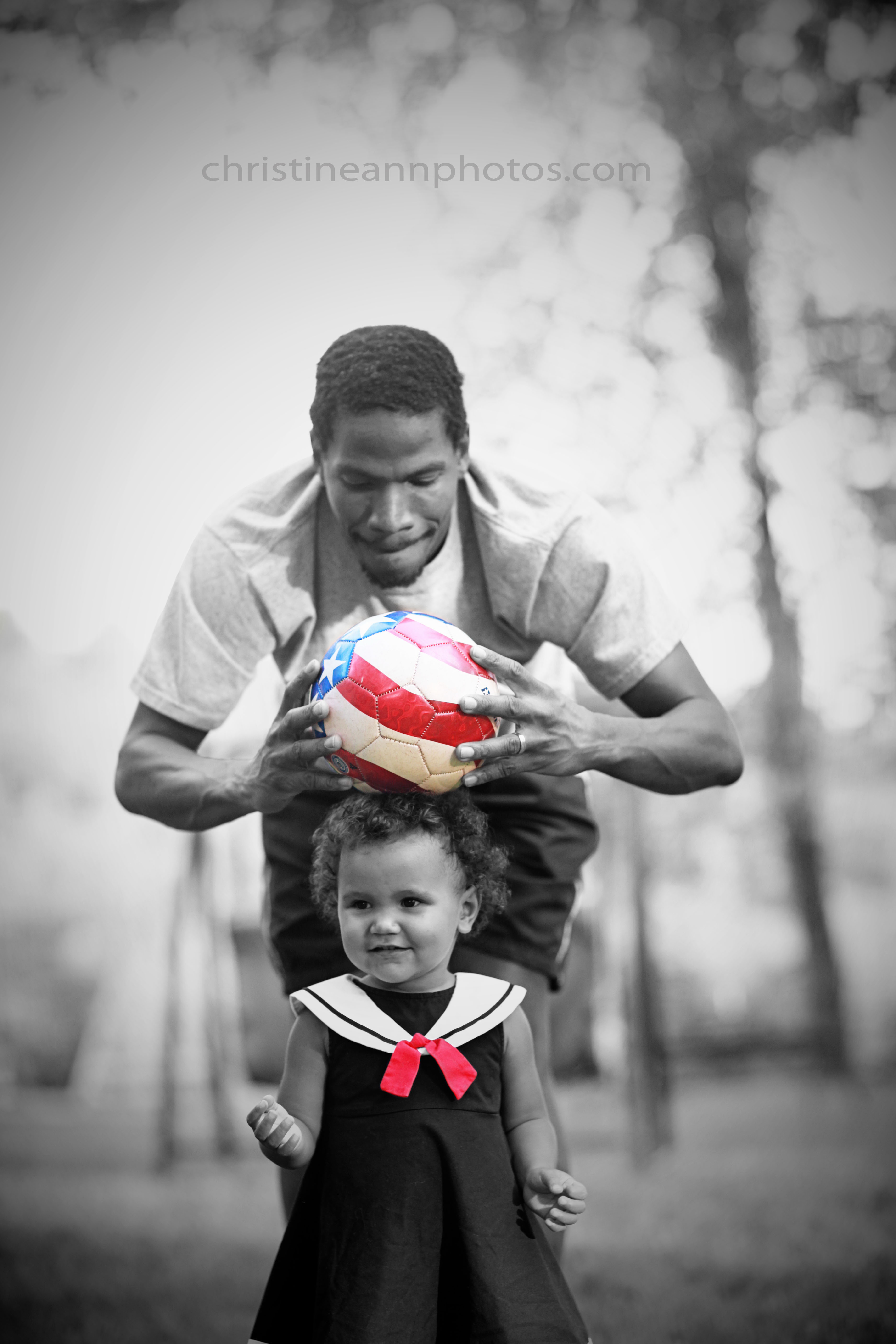
This is pretty self-explanatory.. the first thing to consider and decide on is your font. The font alone makes up a large portion of how your photographs are interpreted. I have gone through hundreds to find mine! The font should be consistent. It should ideally tie in with fonts used on your website, which are the same fonts used on your contracts and business cards etcetc. Keep your brand consistent. There are so many fonts that convey different looks and styles. Some are very elegant, some are very informal “handwriting” ones, some are sans-seriff, some are cursive etcetc.. and this makes a big impact! Let’s take a look at the same photo using different fonts.. everything else is the same except the style of font in these images.


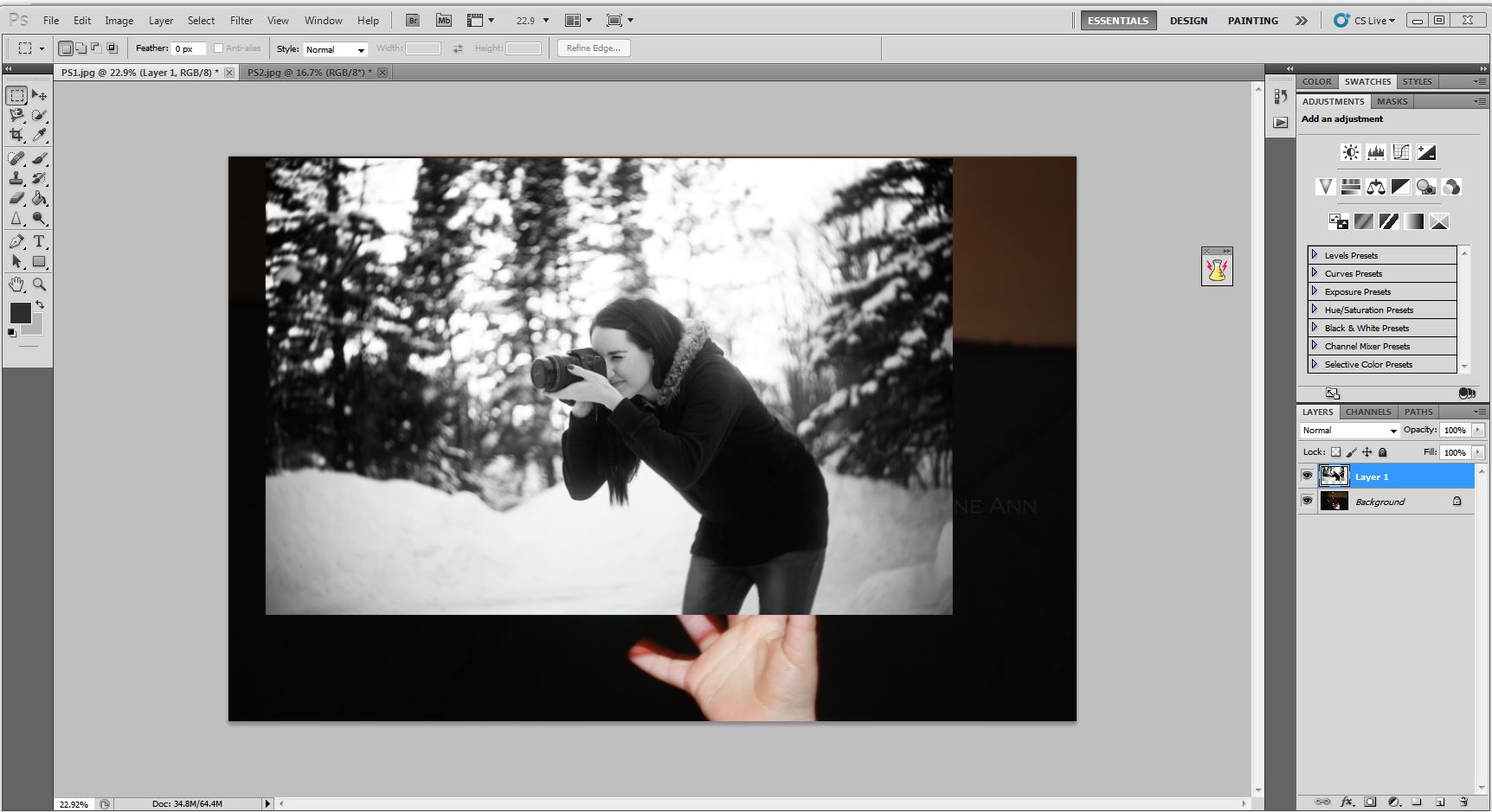
^This is how I chose to watermark this image with all the above factors in mind.
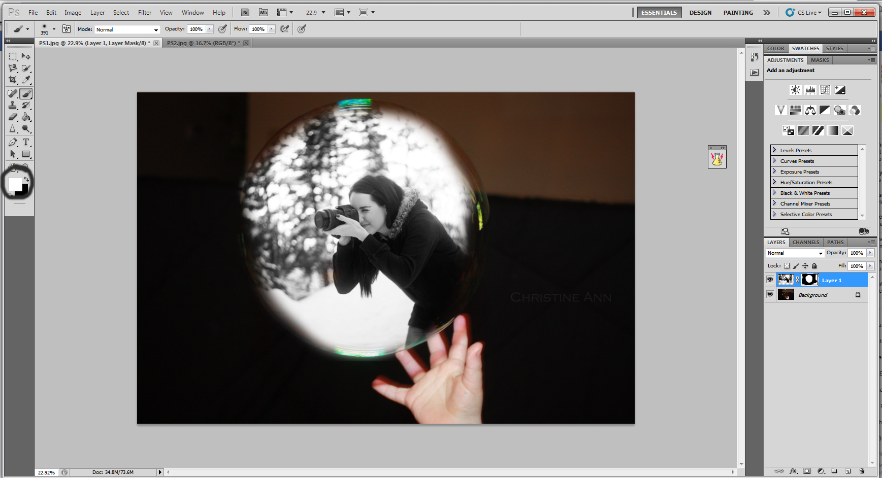
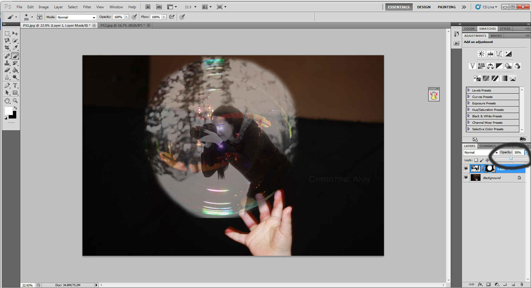
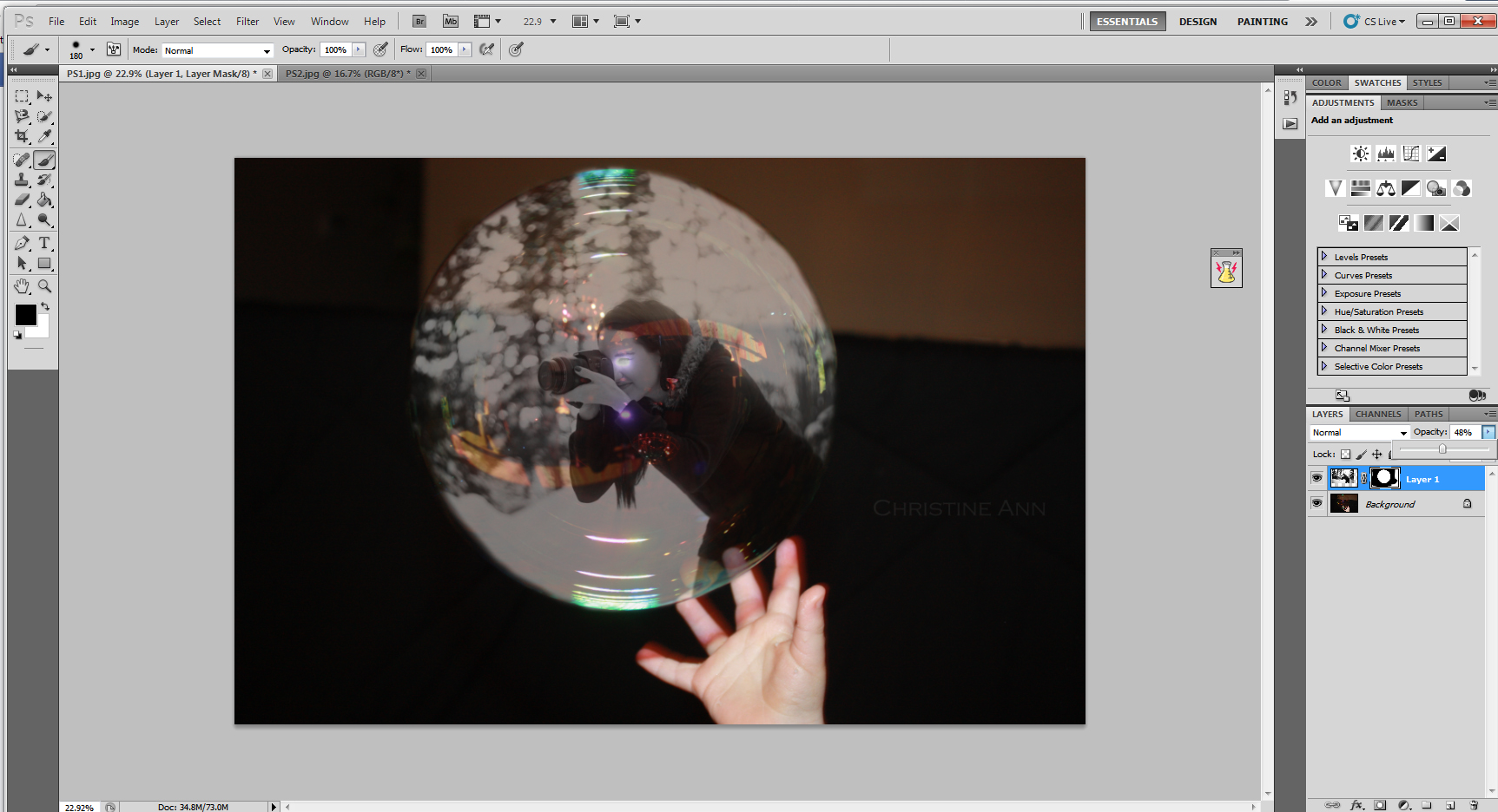
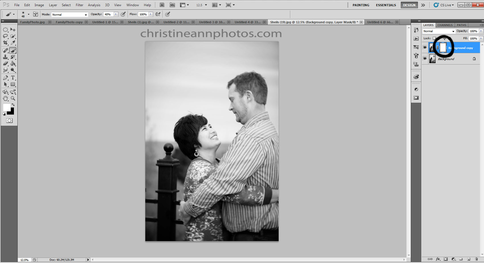
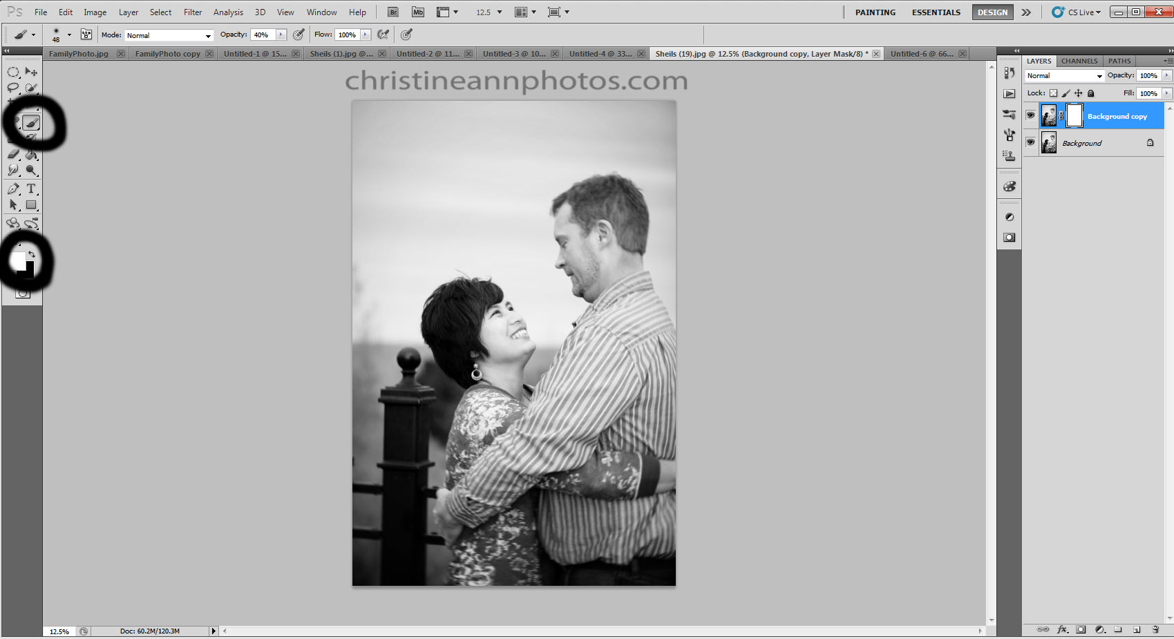
OPACITY
Opacity is how “see through” the watermark is. 5% opacity it will barely show up and 100% opacity means not see through at all. You may be surprised to learn that the opacity of your font plays a pretty big role in how the font ends up looking. I never use font at 100% opacity. Ever. I try to stick around 20-30% (sometimes have to go higher if it isn’t showing up well in the photo). Part of my watermark style is that I don’t want it to take away from the image or distract from it, so I like mine simple, small, transparent, and away from the subject.

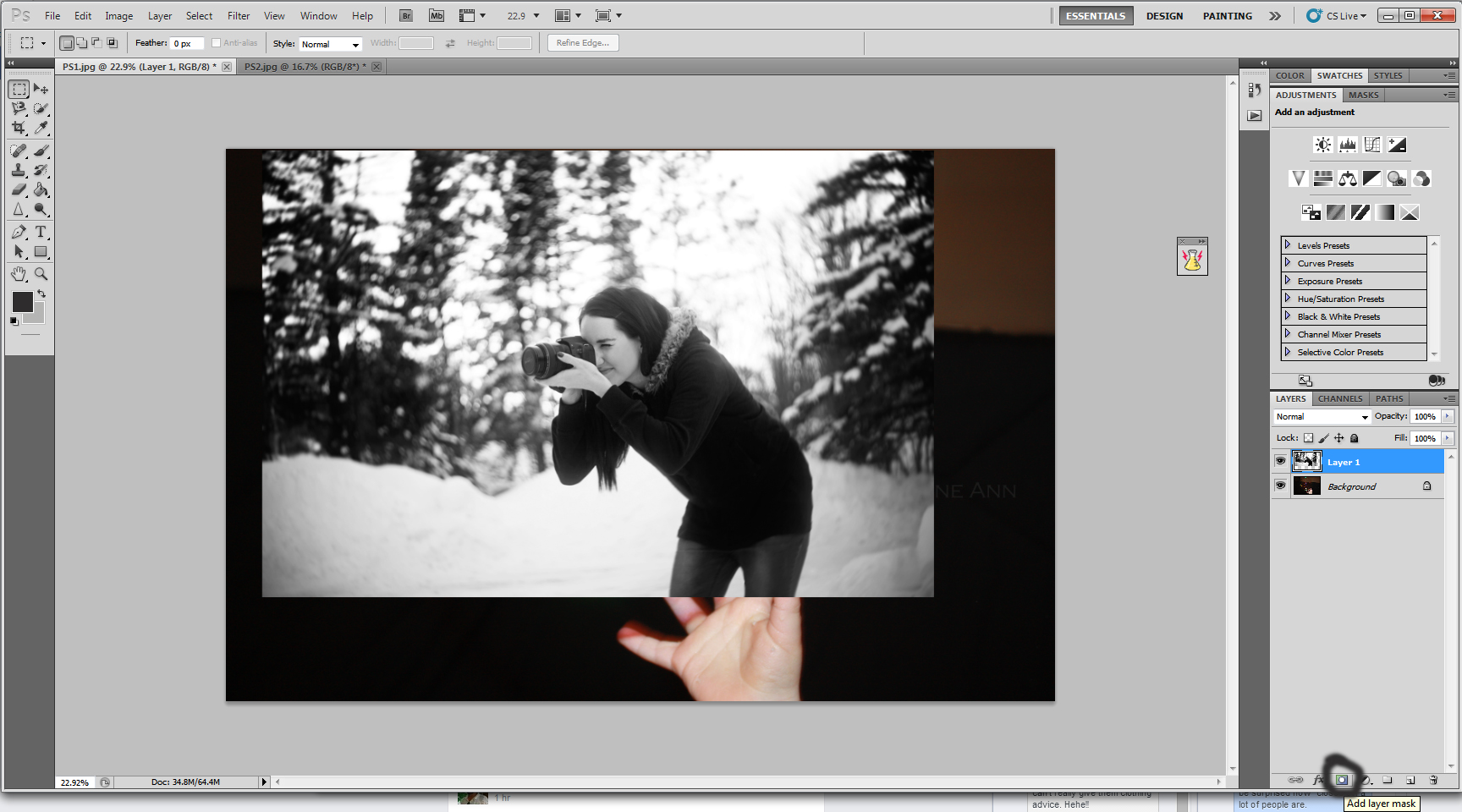
^Compare this image with the one above it. The one above it has the font around 50% opacity and this one is at 100%.
COLOR
The color of your font is surprisingly important as well. IMO pure white or pure black rarely work and color can work depending on the style but for me I always choose a light grey and a darkish grey and switch between the two based on what the image is (if it’s light or dark).

^Compare this image to the ones above it (which are a light grey color).
SIZE
The size of your watermark also impact the image. This is all personal preference but I prefer mine to be small. I feel that big watermarks are very distracting and take away from the image.

^This is the same watermark, just bigger. Makes a big difference.
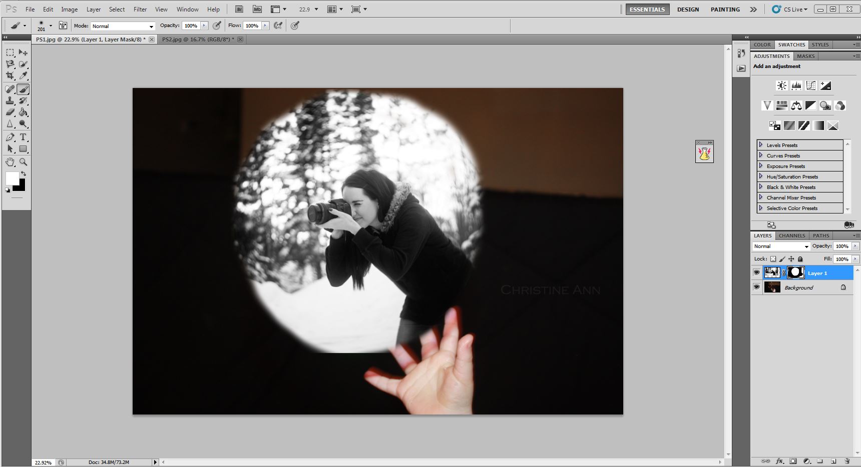
LOCATION
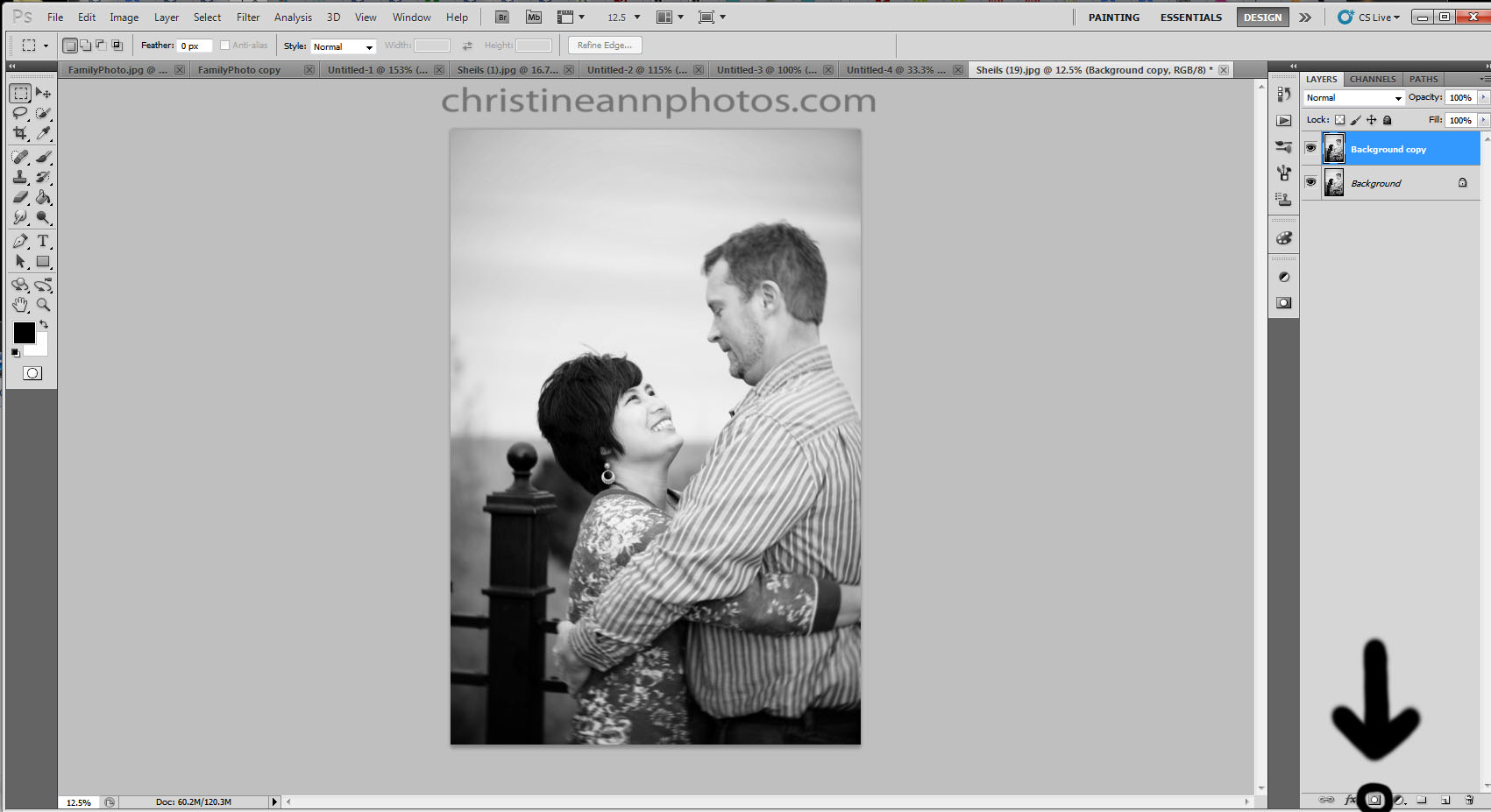
Where you choose to put your watermark is also pretty significant and can change everything. I personally like to hand stamp all my photos so I can figure out where it would look best. I consider my watermark part of the image and I work with the image. Yes it is more time consuming but I think it’s worth it.

^ Notice how my original placement is a part of the photo and it works with it whereas in this one it seems like I’m trying to hide it or it’s an afterthought or generically stamped on all photos in the same lower left hand corner. That can work for some people especially if consistency is important to them but for this stamp and my style I really dislike it down there. Lower corners do work well for some logos though :). Not trying to say what is better or worse just keep in mind that placement affects the photo.
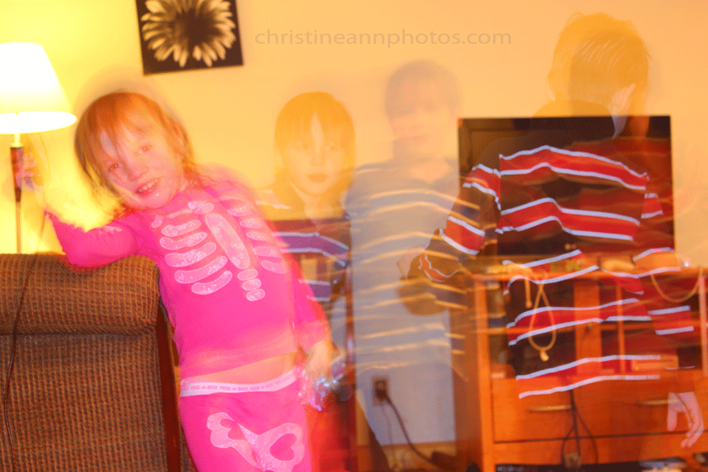
Here’s a quick comparison of my watermark compared to one that pays no mind to all the points above (except the font is the same):

Quite a difference in how you interpret that image, eh?
SIMPLICITY/WORDING
What does your logo look like? Is it simple or complex? Is it font only or does it have an icon with it? All this affects how the image looks. For my style, I like simplicity, that’s why I chose not to include “Christine Ann Photography” in this logo. I am considering adding my city & state though since there are multiple Christine Ann’s out there but I’m not sure yet. I haven’t “launched” this logo yet, I’m still trying to be 100% sure with it before I do.

^ Notice how adding the extra information really change the look/feel of the image compared to when it just said “Christine Ann”?
CONSISTENCY
Your watermark / logo should be consistent with your style of photography. Below I compare the same image with 2 different watermarks so you can see how much the watermark affects the look of the photo.

^Photograph with my watermark on it

^I just put this logo together really quick to show that for an emotive/serious sort of style you wouldn’t want something informal and fun/funny. However if you do a lot of kids portraits, you may not want something formal and would prefer something more fun. So the “right” way to do it is different for everyone but just be sure to assess the style of your photography and the style of your website/branding before choosing your watermark.
To top off this blog post I thought I’d do a few examples of how different the photo can look based on just what the watermark is doing/looks like so you can see how it does impact the final image.


And there you have it.. a bunch of photos to compare together to see how the watermark plays a role in your style and branding.
I should note that there is really no right or wrong answer in here. What works for one person will not work for another, it’s all very subjective and personal. I have my personal preferences about what looks best but I have no doubt there are people reading this that think some of my “playful” watermarks are better than the one I use, haha. It’s okay. I just wanted to write something up to help people be very aware of their watermark, what it’s currently conveying, what they want it to convey and assess if it is conveying that or not.
I just started my business last year and while I knew I wanted a watermark I like, I really had no idea it made as much impact on a photo as it does until recently when I was trying to decide where to go with mine. Hope this has made everyone aware of things they may not have been before!
-Christine Ann


